- More effective onboarding and higher conversions - a structured demo accelerates onboarding and encourages users to open real accounts.
- Lower entry barrier and increased app engagement - tutorials encourage users to explore app, reduce uncertainty and make investing more accessible.
- Gamification for higher retention - progress bars and task checklists increase engagement and time spent in the app.
- Strengthening XTB position as an educational leader - an interactive learning experience reinforces XTB position as a top educational provider in the investment space.
Research and competetive analysis
Industry benchmark
The analysis compared mobile apps, educational features and demo account experiences offered by XTB main competitors. Platforms like Trading212, eToro, Plus500, Interactive Brokers, Saxo Bank and Freedom24 were evaluated based on key aspects such as demo account accessibility, educational resources, onboarding processes, and unique platform features.

Conclusion
- All analyzed companies offer a demo account, with some providing a strong educational foundation.
- Onboarding processes are similar across platforms, differing mainly in the content of their questionnaires. However, none offer interactive tutorials.
- eToro's CopyTrading feature allows users to replicate other traders’ moves automatically, serving as an educational tool, but it is not fully interactive.
- Trading212’s Pies feature helps users create personalized investment portfolios with step-by-step guidance, offering some interactivity, but not for the entire app experience.
Notable benchmark - Tykr.com
Tykr effectively combines investment education with an interactive, modular interface. Its engaging learning modules and structured guidance can enhance user confidence and satisfaction.
Key features of Tykr app:
- Short lessons makes investment education more accessible by allowing for quick, effective learning
- Intuitive features like watchlists, filters, alerts and a trade log simplify investment management.
- Checklists guide users through the investment process, offering a structured approach to decision-making.
Interactive learning insights
The research also included platforms that successfully integrate interactive elements to improve the learning experience. Approaches used in examples below:
- Visible structure (clear steps and tasks to complete).
- Progress tracking (visible progress bar).
- Feedback on passing a step (green marks, achievements, checklists).
- Reward after finishing (level, alert, ending certificate).
Such solutions find their grounding in psychology, which says that activities used in gamification help engage participants and users are more likely to finish the checkout process when they can clearly see how far they've come or what remains to be done (Zeigarnik Effect).
Sources: 1, 2, 3, 4, 5
Codecademy

Duolingo

Coursera

ADPList.org

Business challenges
Several factors may explain why XTB and other investment companies have not yet implemented interactive onboarding features
- Business priorities and strategy
Companies often prioritize rapid client acquisition and activation over extensive learning experiences. Demo account expansion may conflict.
- Development and maintenance cost
Developing and maintaining an interactive tutorial requires significant investment in technology, UX/UI design, research. - Lack of industry benchmarks
Most investments platforms rely on traditional educational methods (articles, longer video tutorials, webinars) rather than interactive tutorials. Without competitive examples, companies may not see this approach as an immediate need. - Regulations
Industry is s heavily regulated environment. Interactive tutorial might need to comply with strict financial regulations. There's also a risk that guiding users through certain actions could be interpreted as providing investment advice.
How to consider that in project?
Regulatory restrictions can be managed by ensuring the tutorial focuses on platform functionality and provides neutral coverage of all instruments without favoritism. I address these potential challenges later in the case study within the tutorial design.
Beginner investors analysis
Analyzing available sources (press articles, research, online opinions, and expert statements) allow to identify the key characteristics and needs of beginner investors in Poland. This insight enables the effective customization of the “Beginner Mode” feature in the XTB app.
Sources: 1, 2, 3, 4, 5, 6
Key findings:
- Aged 20-35, often students and young professionals (IT, marketing, finance, education).
- Main motivations are to build savings, income diversification and personal development.
- Increasing female investors participation and a rise in people with less than 5 years experience.
Main needs and challenges:
- Need for simple and reliable educational materials.
- High value of demo accounts and simulations (risk-free practice)
- Seeking investment communities, mentors and advisors (support).
- Fear of losing capital and complicated investment procedures - delaying the opening of an account
User personas
Based on the collected research data and analysis, I created 3 personas for this project, each representing different backgrounds, locations, unique challenges and motivations.
1. Financial Novice

🏆 Mateusz's impact on final design - Beginner Mode will remind the operation of basic functions from the Demo account he knows from the past and after completing the entire tutorial, he will receive notification that with his acquired knowledge he can confidently move on to the real account.
2. Careful Saver

⏩️ Karolina's impact on final design - due to her limited time tutorial path is concise, there is estimated time and task mentioned. Also she can quickly skip through the tutorial steps if she already knows certain terms.
3. Curious Market Discoverer

🎮 Jakub's impact on final design - tutorial included in Beginner Mode explains the most basic elements and simple instructions from the beginning and he can use help from XTB AI Assistant named "Novo" anytime in the modules.
Customer Journey Example
Scenario: Jakub is installing the XTB app for the first time and wants to see how investing with a Demo Account works.

Jakub's motivation declines as he progresses through the app. He explores various features but does so blindly, without clear direction. Despite his frustration, he remains motivated and returns to the app to learn, though this process is time-consuming and leads to errors.
Final design visuals
Main design guidelines:
- Proper balance in the structure of Beginner Mode between simplification and realistic investment experience (basic interactive structure)
- Learning content should avoid language that might suggest specific investment strategies or a guarantee of success - tasks do not encourage users to engage in risky investment behavior (messages at the beginning of the module)
- Determining the real value of completing all tutorials (access to premium materials for beginners)
- Taking into consideration users who are complete beginners and those who already have basic knowledge, but are delaying setting up a real account and want to check knowledge (skip to quiz)
Home screen
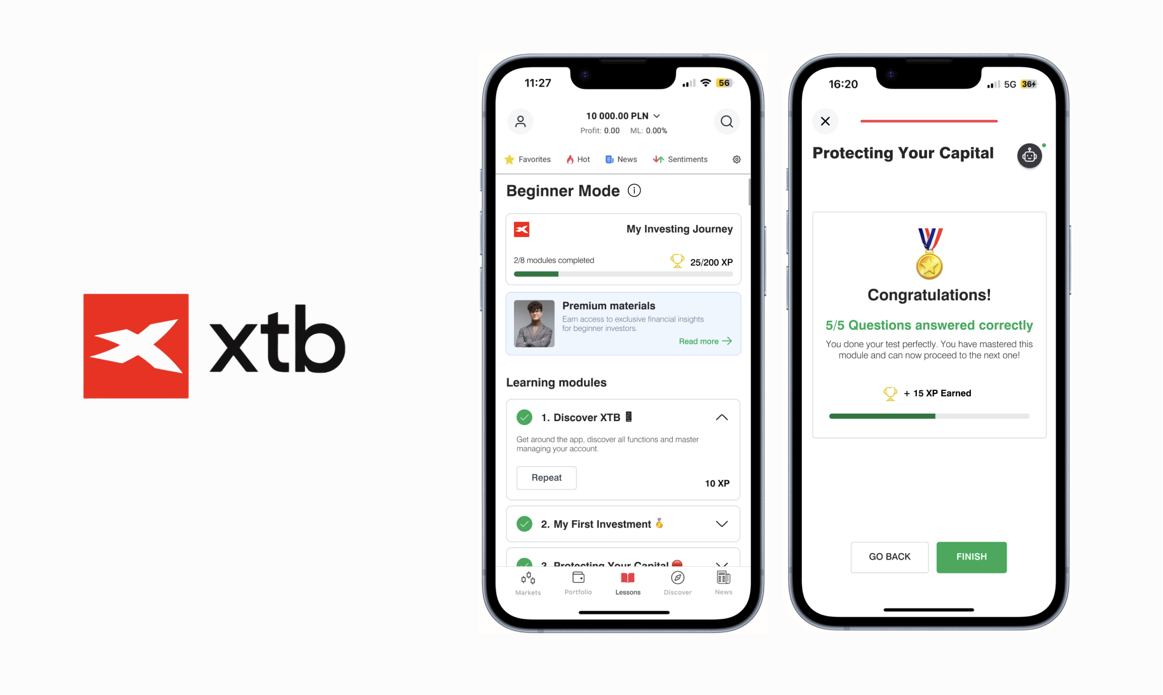
Welcoming modal serves to immediately introduce user to Beginner Mode and the benefits of using it, before they even start exploring their demo account. For even easier access to learning features, I used a toggle button on the home screen and added a “lessons” item to the navigation bar.
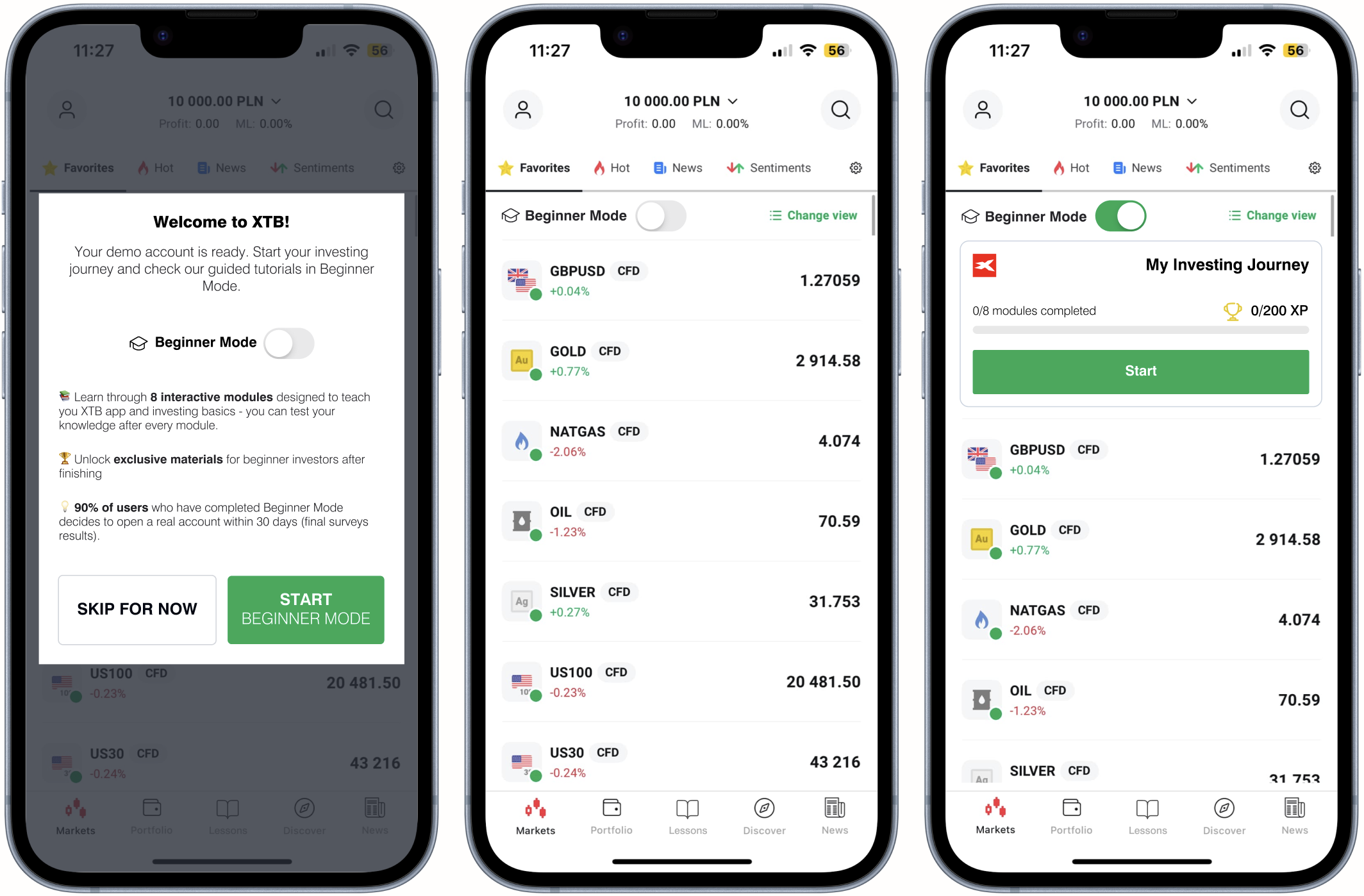
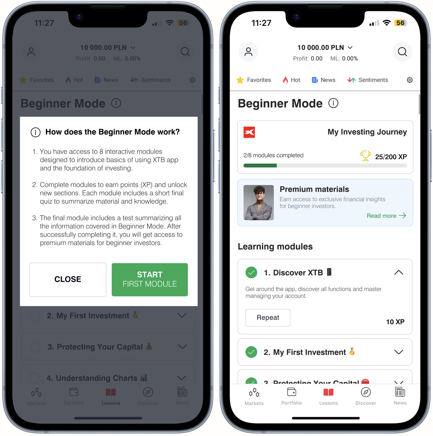
Beginner Mode inside view
For additional support for new users, I placed “i” icon next to main heading to explain how the whole idea works. Each component includes the title of the module and a description, so that the user knows the scope of information in it and how many points can be gained by completing. Keeping in mind research insight that users are more likely to finish the checkout process when they can clearly see how far they've come, an icon next to the title indicates the percentage of completion of a particular module. I designed also a secondary button that is visible after completing module, so user can repeat the whole thing if its needed.
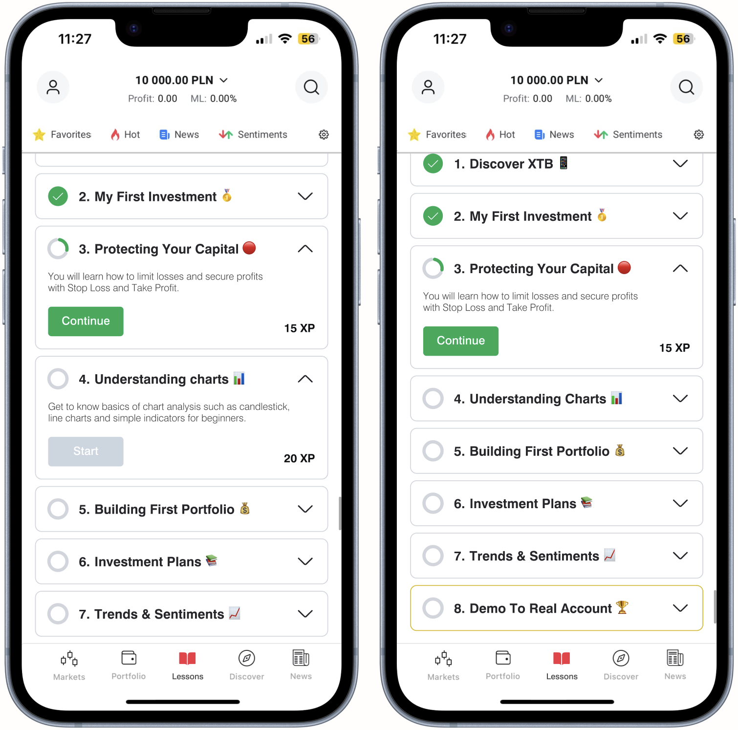
Sample educational module
To make the process as clear as possible, I've included icons under the module header suggesting approximate completion time, number of tasks and points to be earned. In accordance with the regulations mentioned earlier in research, an informative message appears that the content in the module is not investment advice. Those with basic knowledge can go straight to the quiz, but are informed that this is not the recommended way.

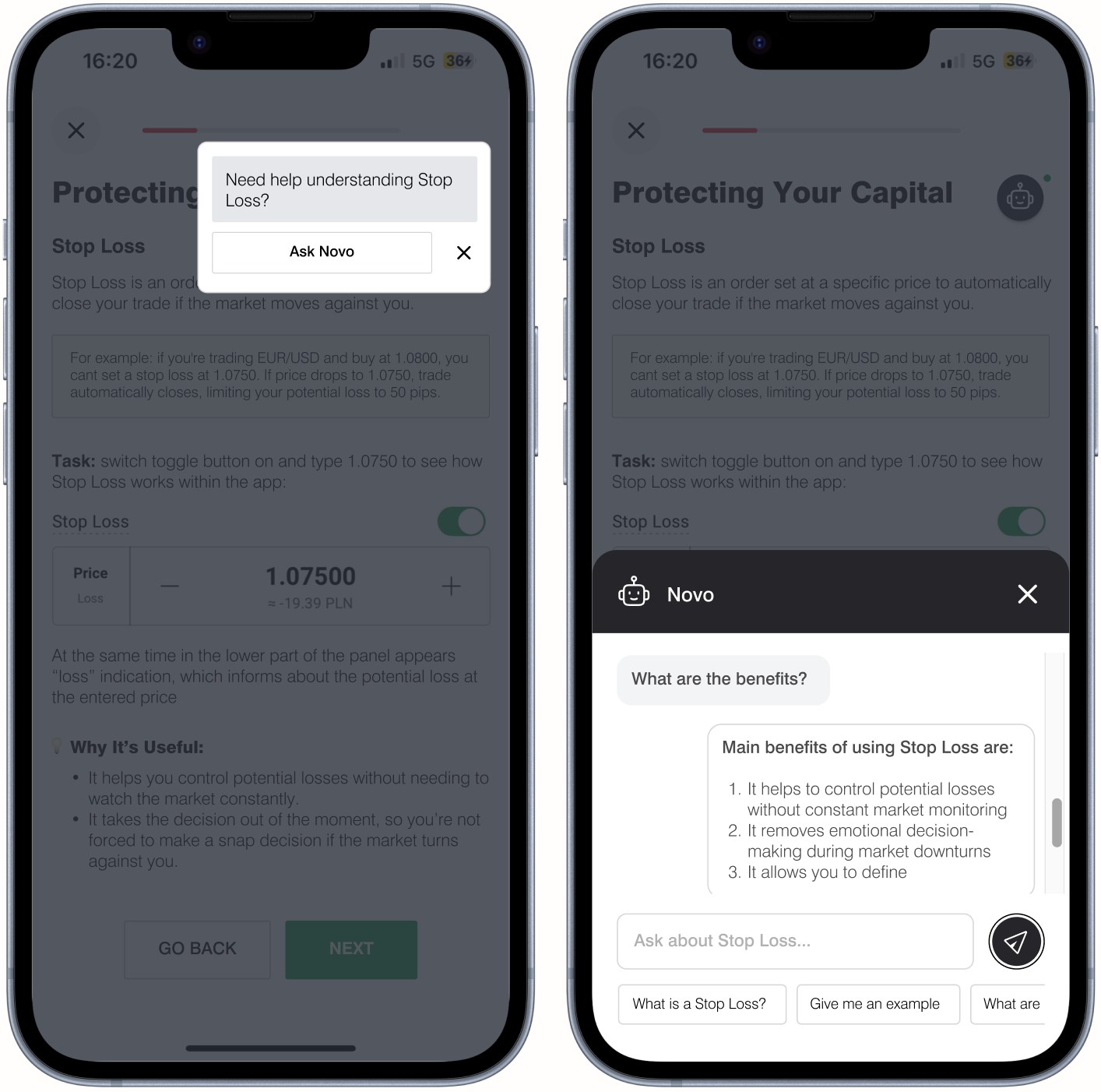
Tasks inside modules are marked out with a specific icon that repeats in all modules and tips to improve the task execution. At the end comes the practical use of all the given information and what is important: user completes tasks on the interface of the XTB app, meanwhile strengthening knowledge about the particular functions.


In order to not overload users with content, but ultimately to give them ability to acquire more information, I added AI Assistant named Novo to the learning modules. It works in a similar form to the well-known chatbots for customer service. My decision is dictated by the growing use of ChatGPT and other AI tools for information acquisition by young people (according to SalesForce research 65% of generative AI users are Millennials or Gen Z).
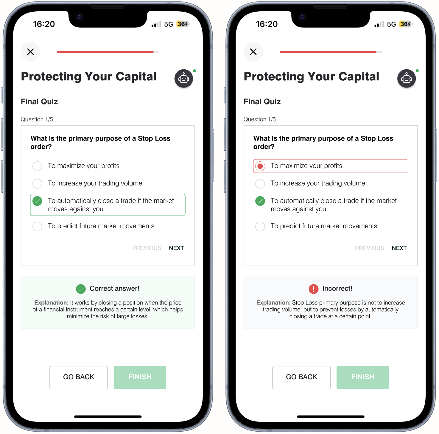
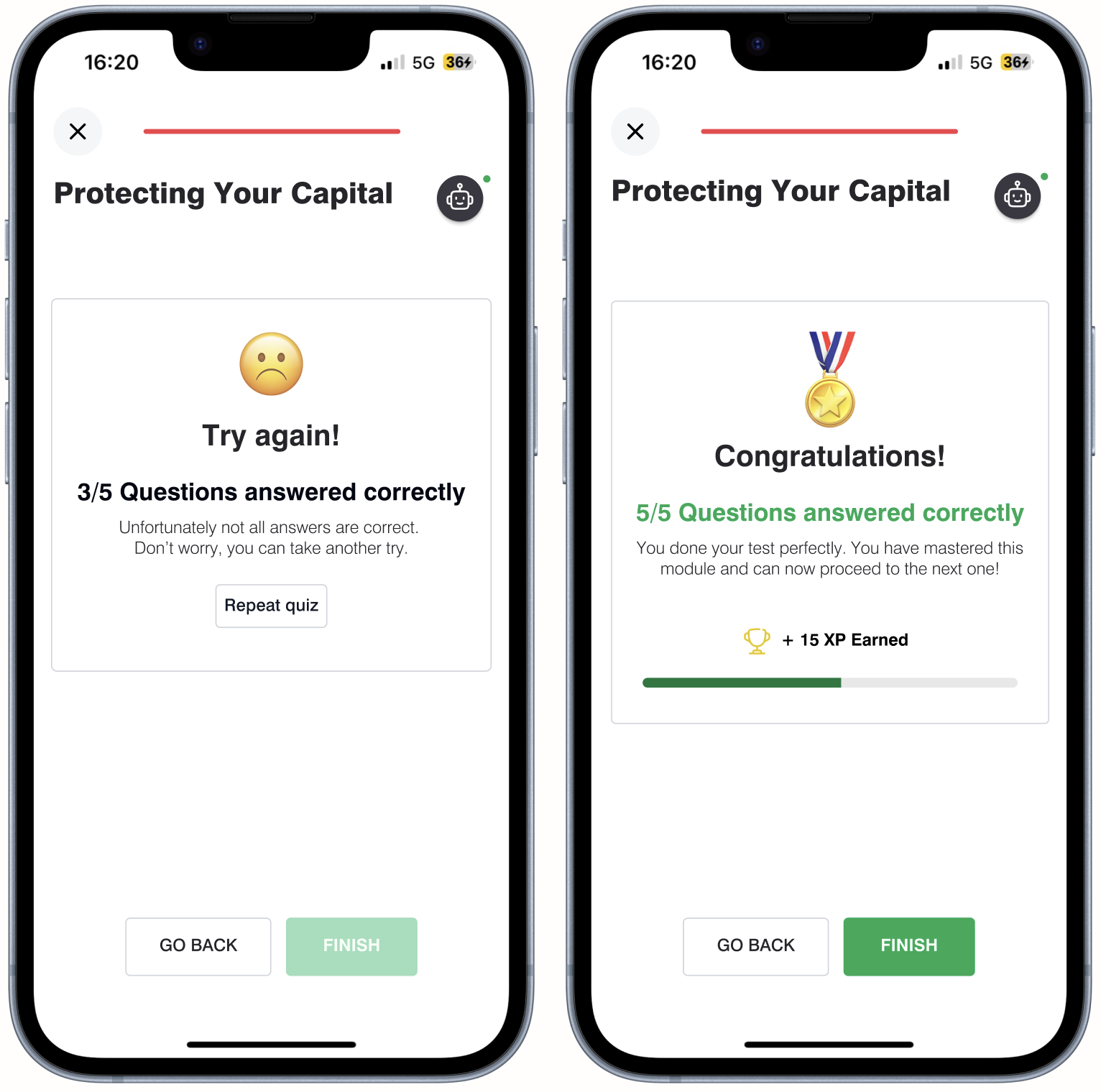
Wrap up of the module is finishing short quiz that requires a minimum 90% correct answers. The application displays information about the correct answer in real time and provides explanation. In case of failure, user can try again (the number of approaches is unlimited).
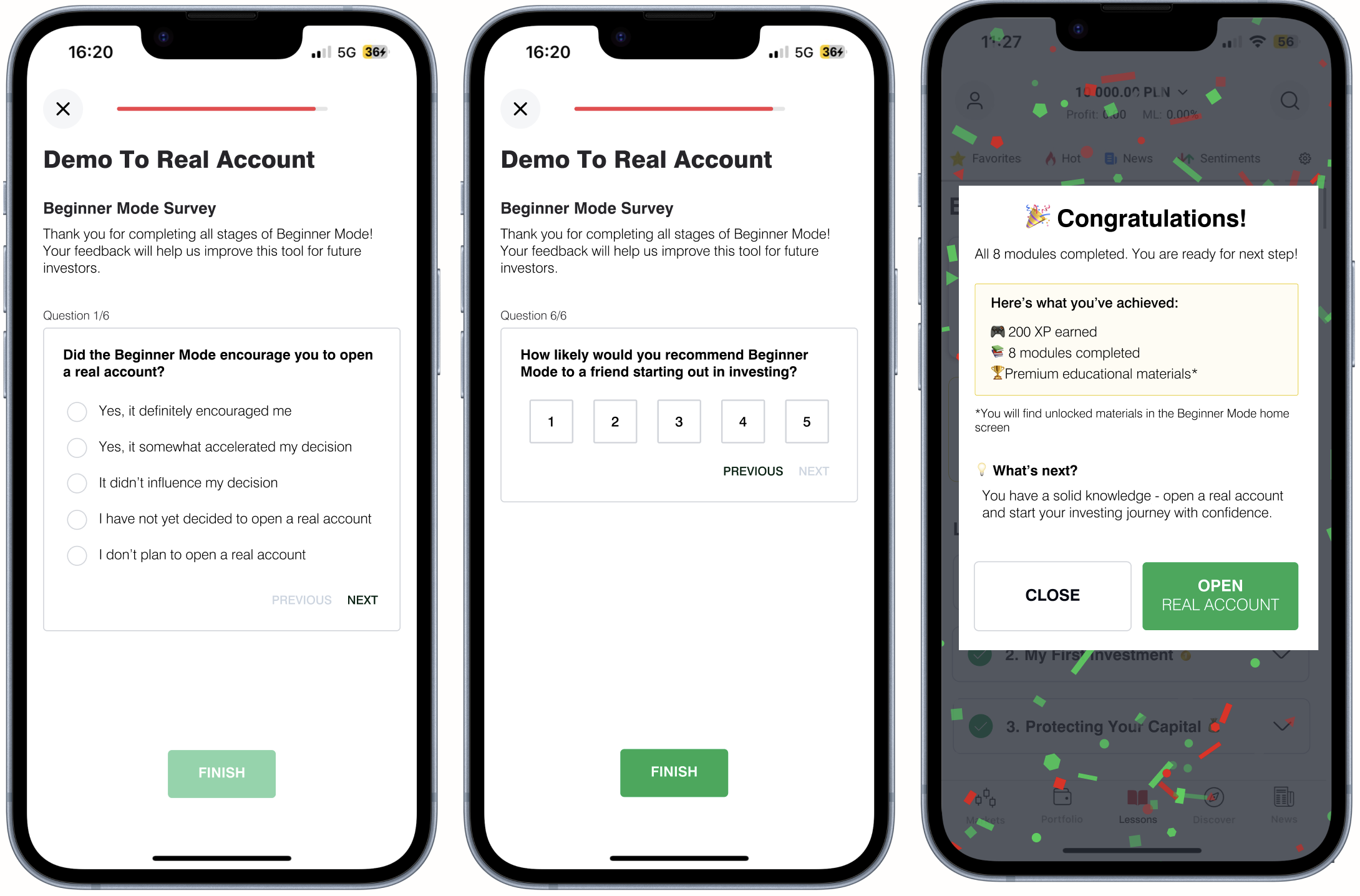
NPS survey and final message
For more effective feedback gathering on Beginner Mode performance, the last task of the final module is to complete a short NPS survey. Upon completion, users get a summary of their achievements and they are encouraged to open a real account. This message effectively realizes the “moment of achievement” in user experience design - the key point at which a user feels satisfaction with a completed task and is most open to taking the next step (conversion).
Concepat validation and KPI's
Despite the fact that this project is fully conceptual, to verify effectiveness I would use following KPI's
Engagement
- Average Session Duration: time spent in the app per session after the introduction of Beginner Mode (target: +35%)
- User Activity Growth: average number of sessions per user within the first 14 days (goal: 5+ sessions per week per user)
- Tutorial Completion Rate: percentage of users completing all interactive modules (goal: >65% of users finish Beginner Mode).
- Bounce rate reduction: Decrease in users abandoning the app within the first 5 minutes (goal: reduce by 25%).
Conversion rates
- Increase in users upgrading from a demo account to a real account (goal: +20% uplift).
- Reduction in the time it takes users to move from demo to real account (goal: from 30 days to under 21 days).
- Percentage of users making their first investment within a week of completing Beginner Mode (goal: 70%).
Retention rates
- 30-day and 60-day retention of Beginner Mode users compared to those who skipped it (goal: 20% higher retention for Beginner Mode users).
- Percentage of real account users revisiting educational content at least twice per month (goal: 50% of users return to learning section).
- Frequency of returning to the education section after opening a real account.
Customer service involvement
- Decrease in the number of customer service inquiries related to onboarding and basic account usage (goal: 30% less phone calls and emails from new users).
Reflections and Lessons Learned
💡 What I learned during project:
- Small changes in investment apps are highly complex – through research, I realized that even minor modifications in a trading platform require careful consideration.
- Refining AI-assisted research & synthesis – since I didn’t have access to internal XTB data or user insights, I leveraged AI to summarize reports, analyze competitor strategies and extract key trends.
- User onboarding is more than just UI simplification – a good onboarding process isn't just about making the interface visually clean but ensuring the experience aligns with user expectations, potential cognitive overload and the right level of hand-holding.
🔎 Biggest challenges:
- Designing conceptual educational path – balancing usability, engagement and financial literacy while ensuring that users don’t feel overwhelmed or misled required careful consideration
- Striking the right balance between simplicity and depth – making investing feel approachable, yet not oversimplified crucial concepts like risk, leverage, or market behavior is a big challenge.
- Language & terminology – avoiding overly technical jargon while still being precise and in line with regulations.
- Aligning the design with XTB’s existing app – without access to XTB’s official design system, I had to rely on publicly available materials and my own UI adaptation skills to create a coherent and realistic prototype.
🚀 Potential next steps for the concept:
- Advanced educational features – implementing adaptive, personalized learning paths based on the user’s engagement level and placing some features as interactive hints inside main app views
- Progress tracking & feedback loops – giving users real-time feedback on their demo trades to reinforce learning (e.g., "You just placed your first leveraged trade – here’s what it means for your risk exposure").
- Marketing & Communication Strategy – collaborating with the marketing team to design a full-scale communication strategy for the Beginner Mode and it's target group and matching this with current educational activities (meetings, workshops, webinars).