Prototype first - design later. Vibe coded desktop app delivered in 6 weeks
How we optimized daily work of car service and delivered a desktop app in 6 weeks by implementing Vibe Coding, AI prototyping and Bubble development.

Overview
The standard process would be: run workshops → build wireframes → show client mockups → get feedback → hand off to developers. We skipped straight to a working app.
When a car repair shop owner came to us with a broken workflow and no tool to replace it, we used Lovable to build a functional prototype within days. The client tested a real, clickable product before we touched Figma. That one decision changed the quality of feedback we got, the speed of delivery, and what the final product actually looked like.
Situation
The client ran an independent repair shop where every quote and every scheduled job depended on one number: how long will this specific repair take? That number came from a commercial estimation tool they’d used for years, until the subscription ended.
Rather than renewing, the client saw it as the right moment to switch. The old tool had always been a compromise: built for dealerships, not independent workshops. It didn’t account for older vehicles, non-standard parts, or the reality that two mechanics can do the same job in very different times.
The expired subscription was the trigger to finally build something that fit how his team actually works.
Task
Our goal was to build a desktop app that would let the workshop manage their own repair database independently, without relying on third-party data. The design brief was shaped by the environment: mechanics work fast, often with dirty hands, in loud conditions. Every decision had to earn its place.
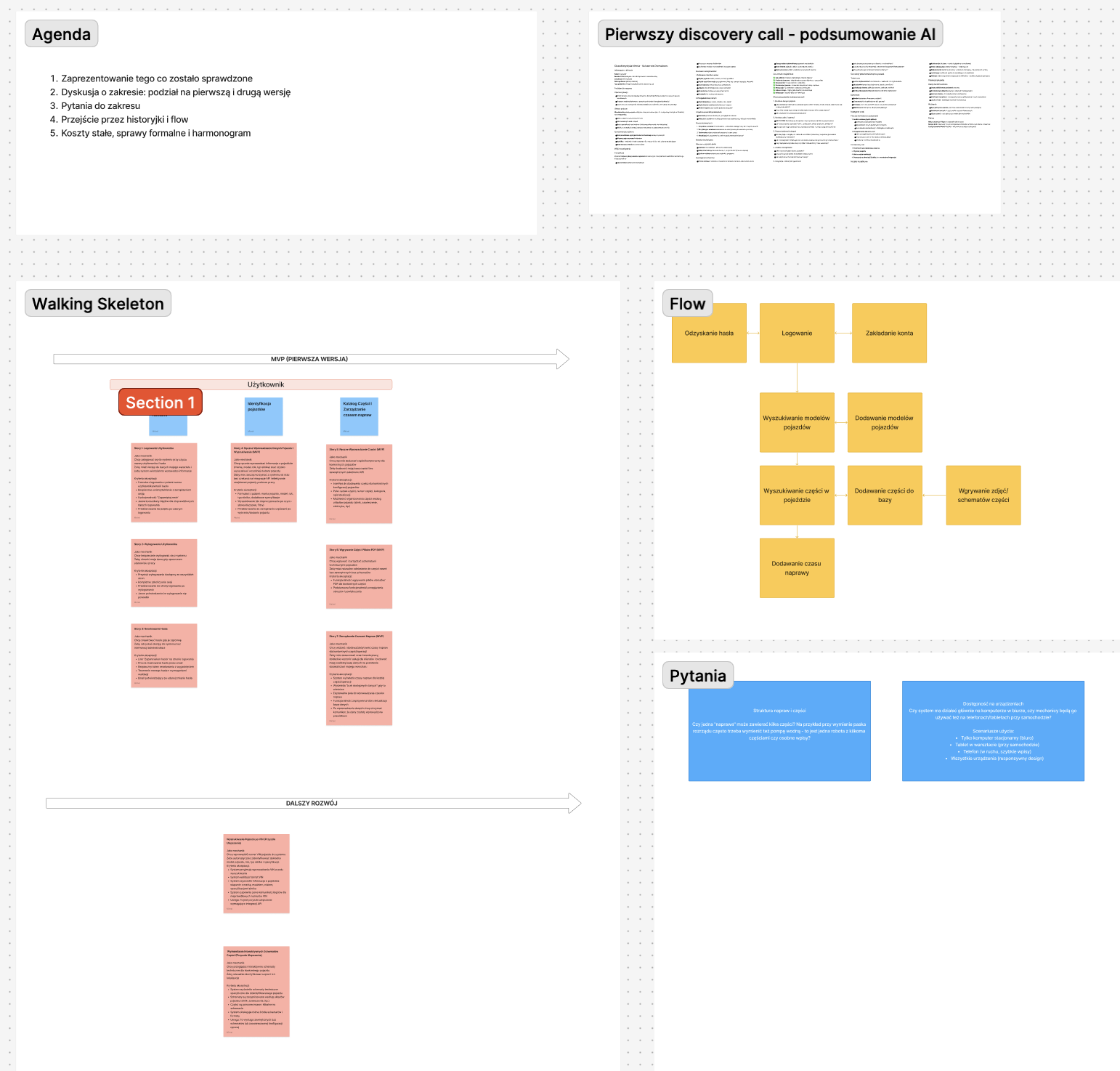
A discovery workshop helped us identify five core needs:
- a vehicle search dashboard
- manual parts and repair-time management
- technical diagram uploads with numbered repair references
- a role system separating mechanics from administrators
- confirmation dialogs to prevent accidental data loss
Main design requirements were:
- minimalistic, neutral design with one primary color, without unnecessary visual distractions or animations
- highlighting important repair parts and categories with appropriate icons (faster identification during work)
- assigning repair components with numbers referring to the legend of a technical diagram
- ability to change core data only for administrator, not daily users
Action
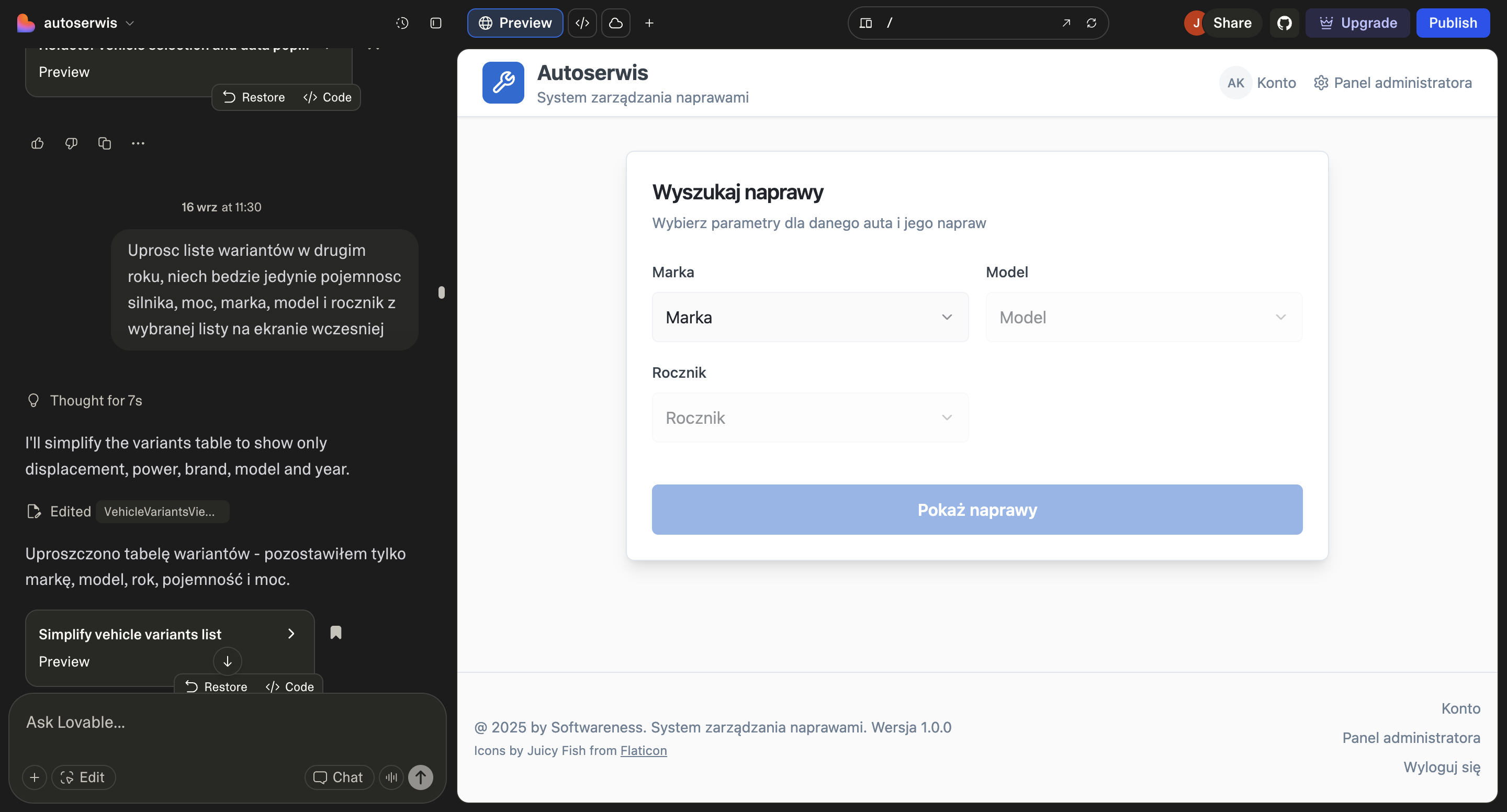
Before opening Figma, I researched similar tools and gathered visual references that matched the functional, no-distraction environment of a workshop. With that context and the workshop insights, I built the first working prototype in Lovable - treating it as a thinking tool, not a final deliverable.
The goal was to give the client something real to react to.
Key decision - why prototype first?
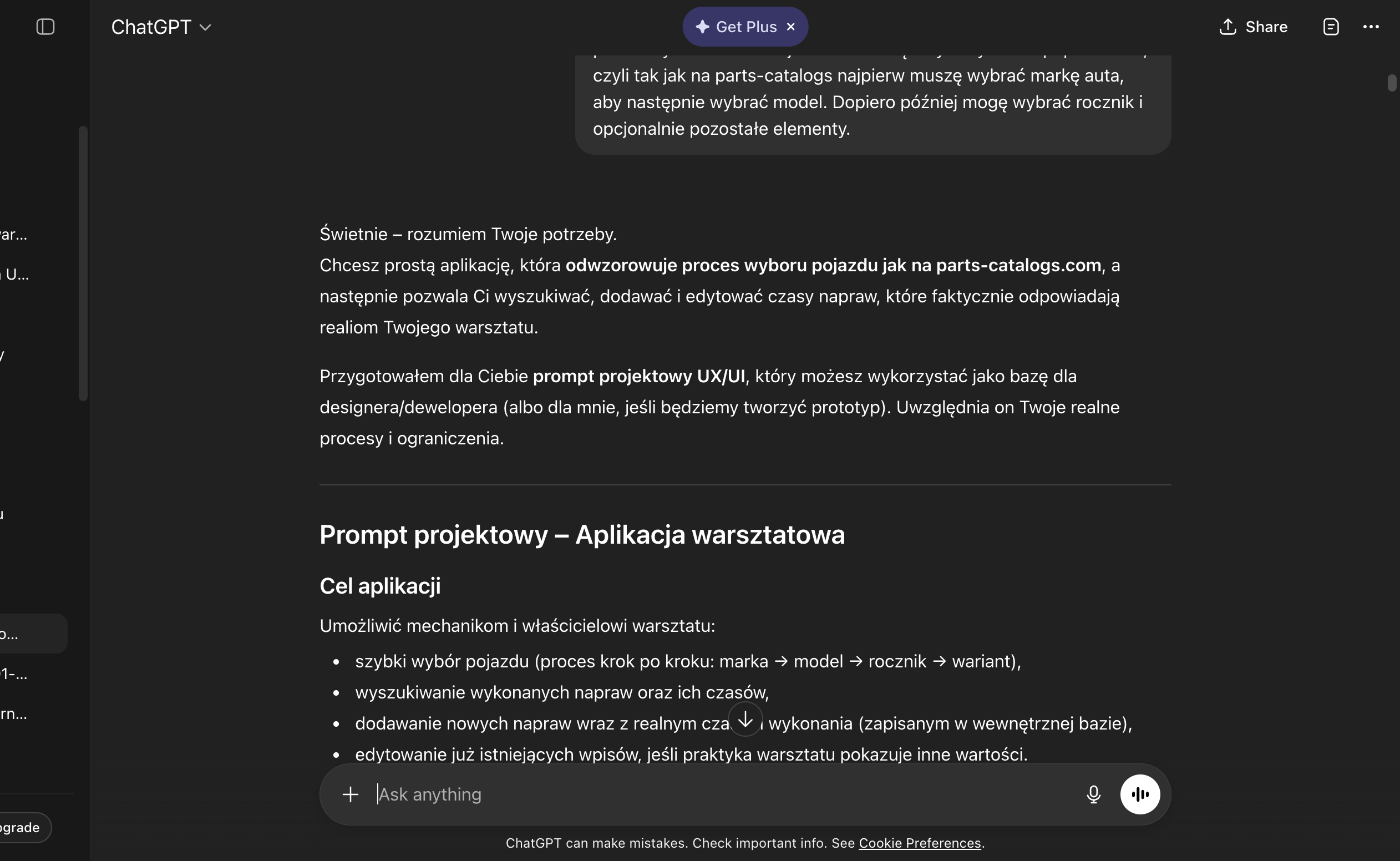
Instead of presenting static mockups, we sat down with the client and let him click through the prototype. The conversation immediately shifted from “does this look right?” to “this is not how we’d actually search for a car.”
We iterated on the prototype before touching the final design. By the time we moved to Figma, the flow had already been validated.
How I outlined the design context in Lovable:
- I described project context, listed user needs, presented the entire user flow and scope of the application - all summarized on information taken from the workshops with client
- I addressed the user’s main goals, what they want to achieve with the application and what the tools currently used by the client can’t provide
- I attached inspirations from similar tools collected during my research and specified what visual effect I would like to achieve (and what to avoid in terms of UX)
- I used other tools examples gathered during research and put them as a reference for visual effect and features that can boost the product usability
Testing with client and next iterations
Client, who was project stakeholder, was also a user facing specific challenges in his work, so we tested the solution with his input and identified potential difficulties in real time. Client feedback helped refine priorities and interactions before finalizing the visual layer.
Result
The handoff package was built around one principle: the development team should never have to guess. The Figma file included an interactive prototype with transition guidelines, a component library, empty states, and a full admin panel.
The app was delivered in Bubble.io in around 6 weeks. Every major interaction had been tested on a live prototype before a single production screen was finalized.
Typography and assets
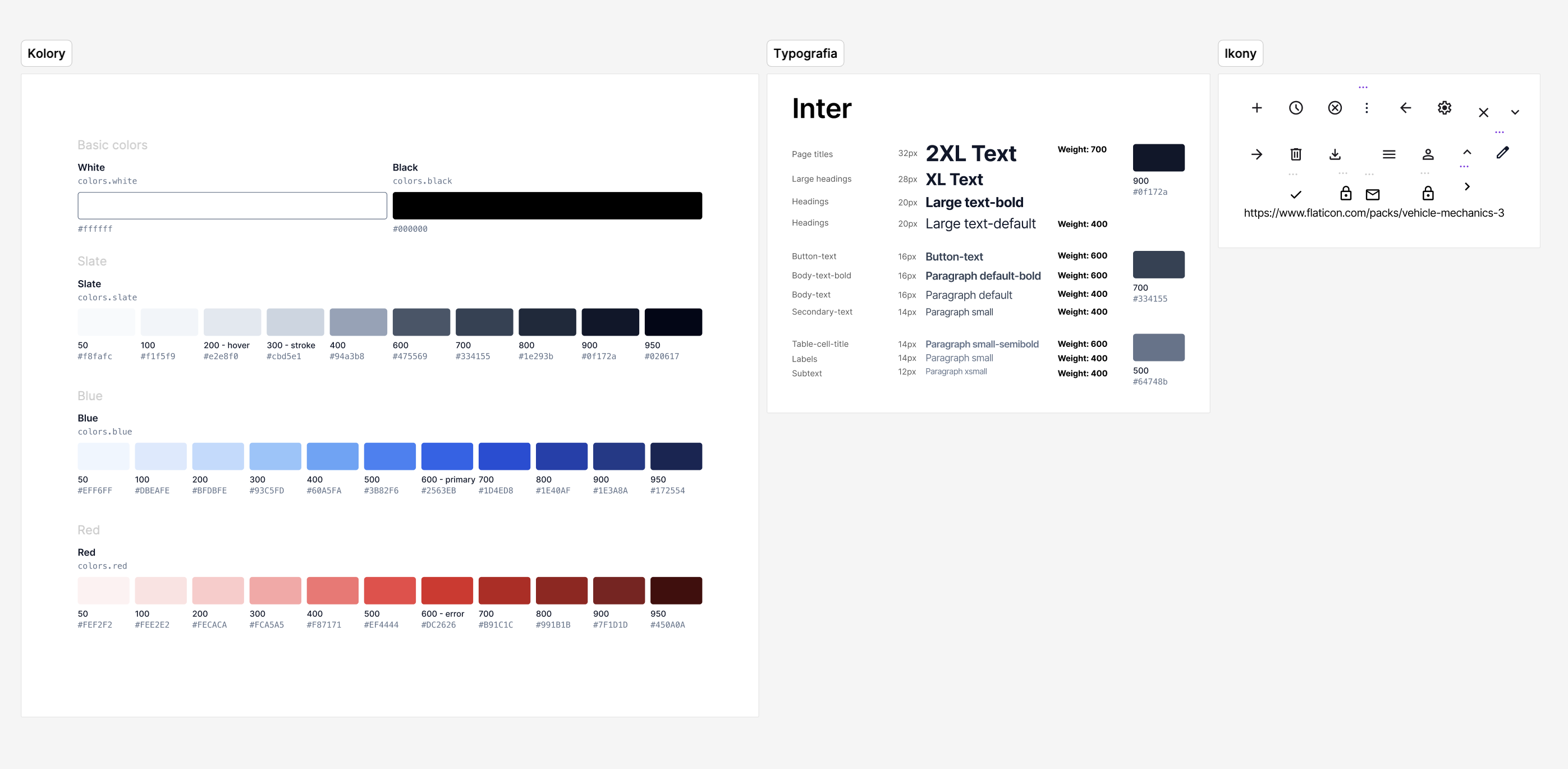
Components and variants
Final view examples
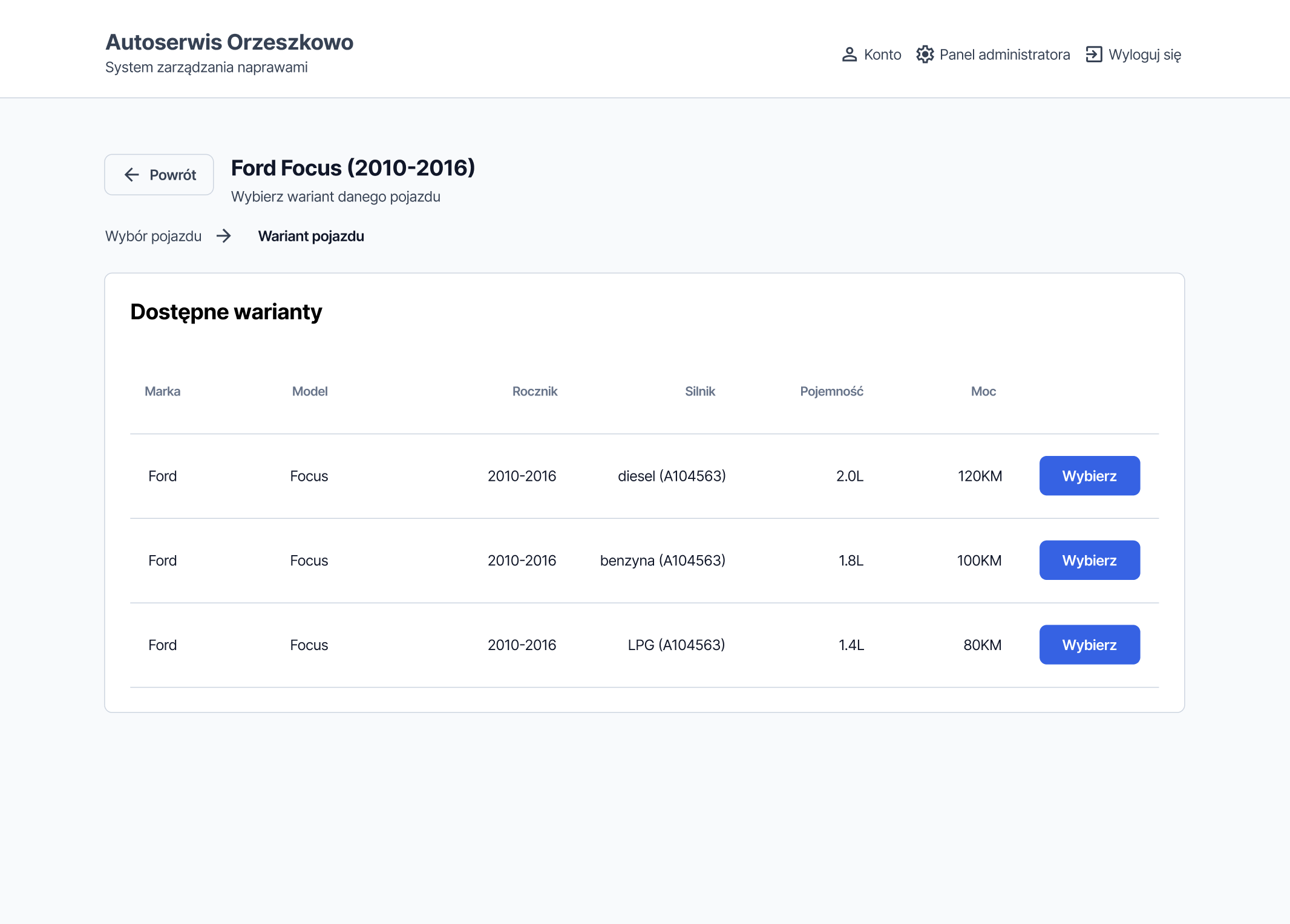
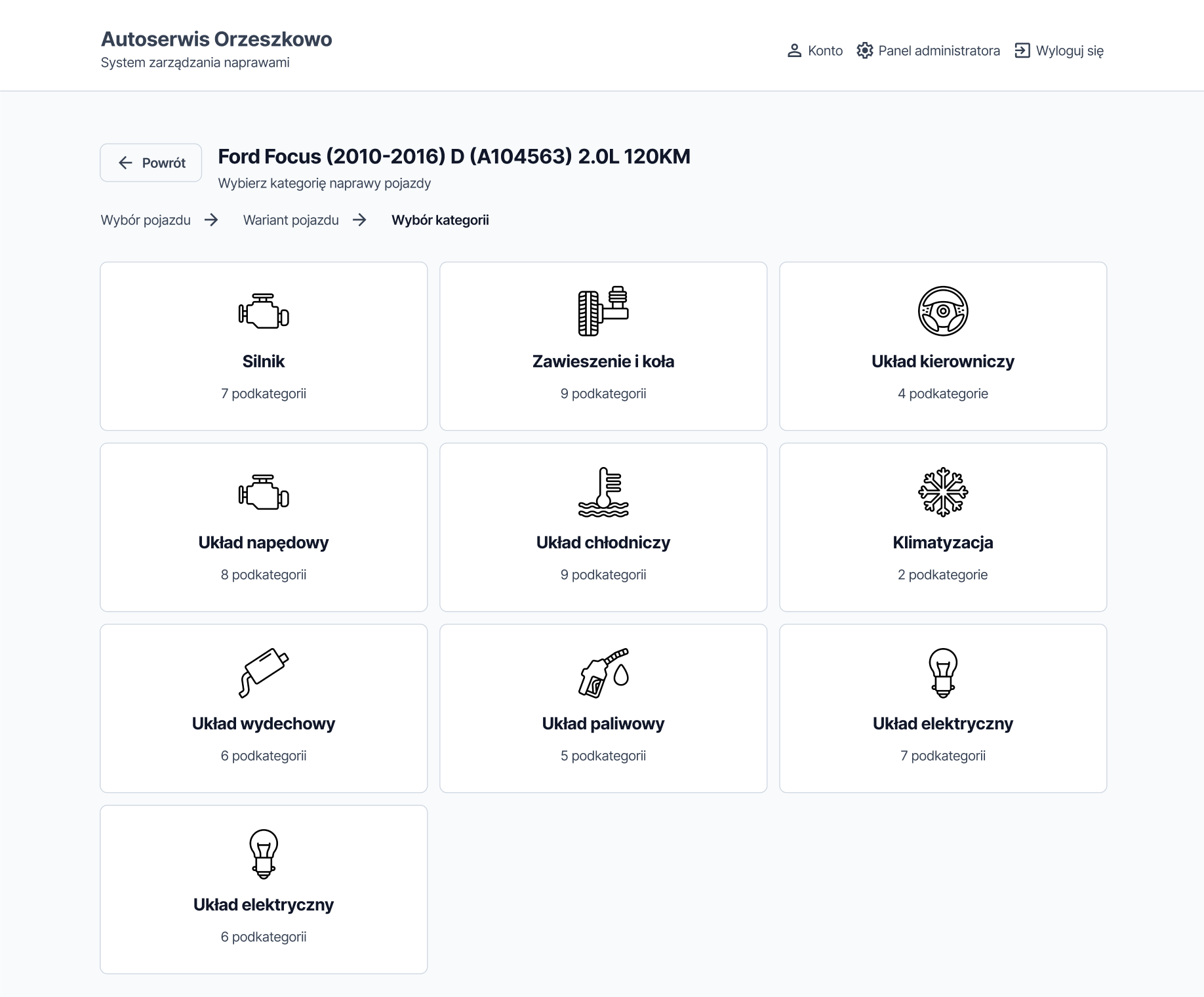
User view
Progressive disclosure: mechanics see only what’s relevant at each step. Showing everything at once in a high-pressure work environment increases errors - so we didn’t.
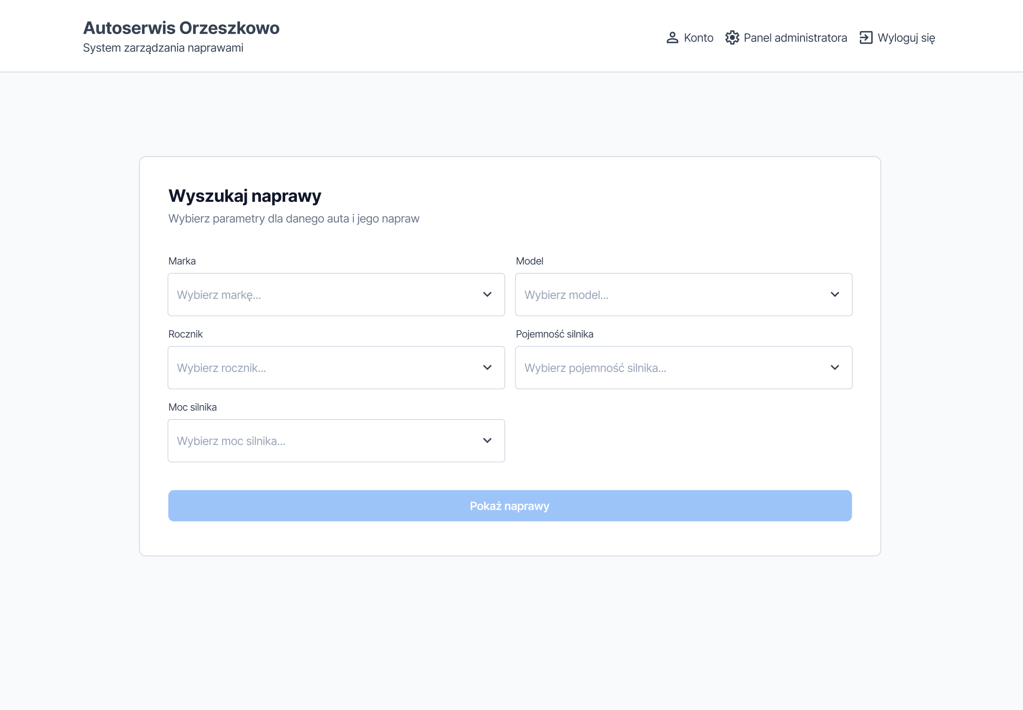
On every screen in the flow, the user also has access to breadcrumb navigation to move freely between sections.
Large, familiar icons came directly from a workshop constraint: mechanics often navigate the app mid-repair, scanning the screen rather than reading carefully. Text labels alone weren’t enough.
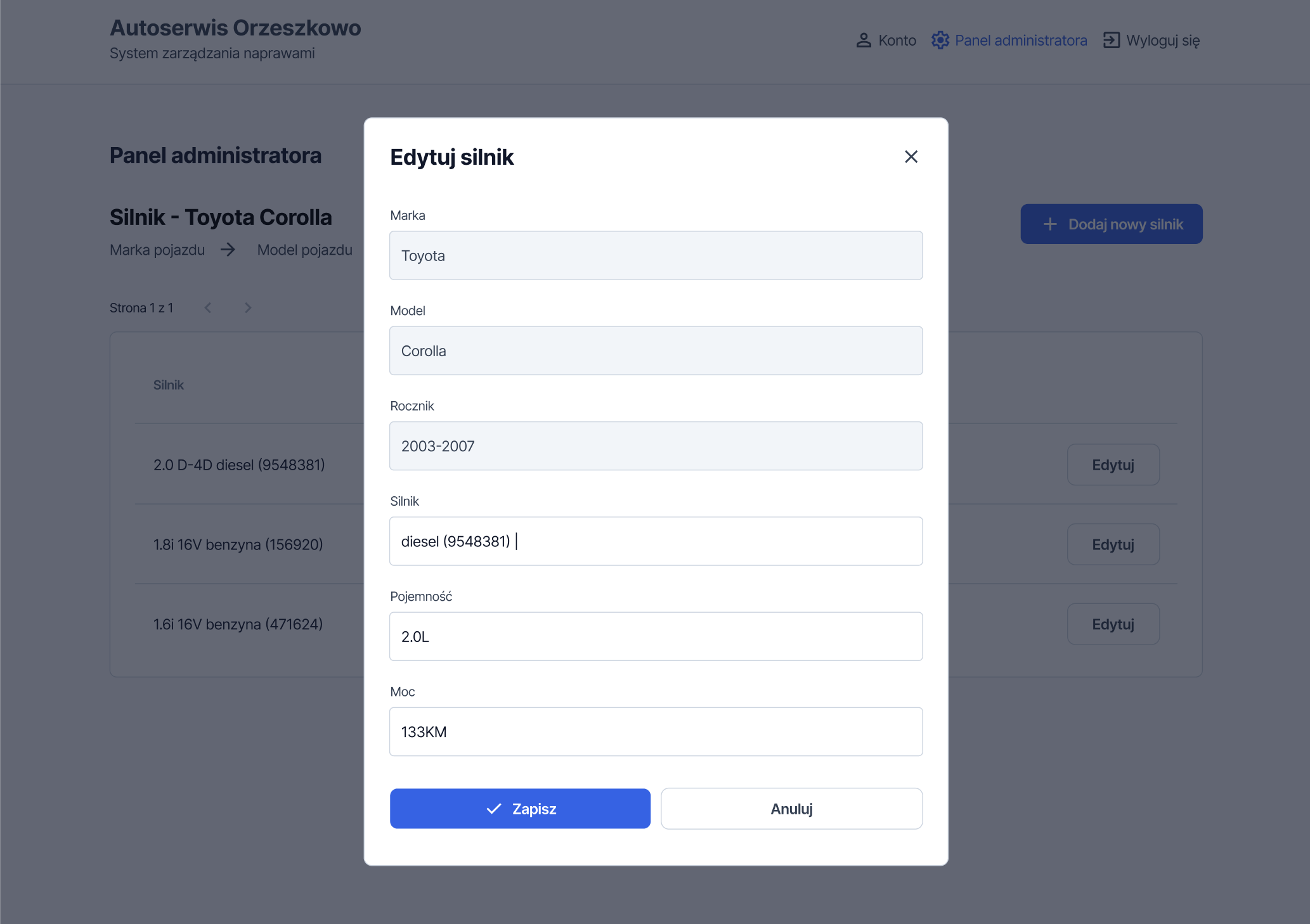
To protect the database and prevent potential errors or the accidental deletion of important repair categories, users cannot make changes at this stage. The main categories are pre-loaded, and any changes apply only to the subcategories and repairs themselves.
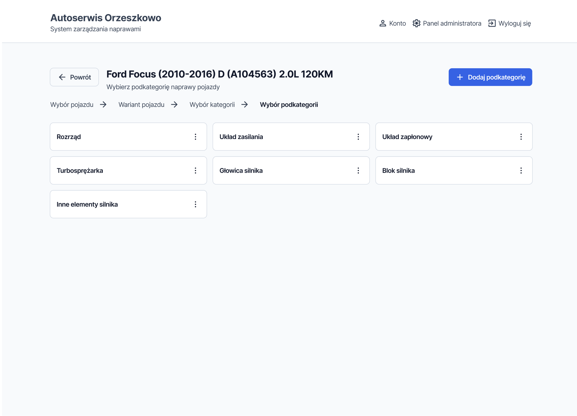
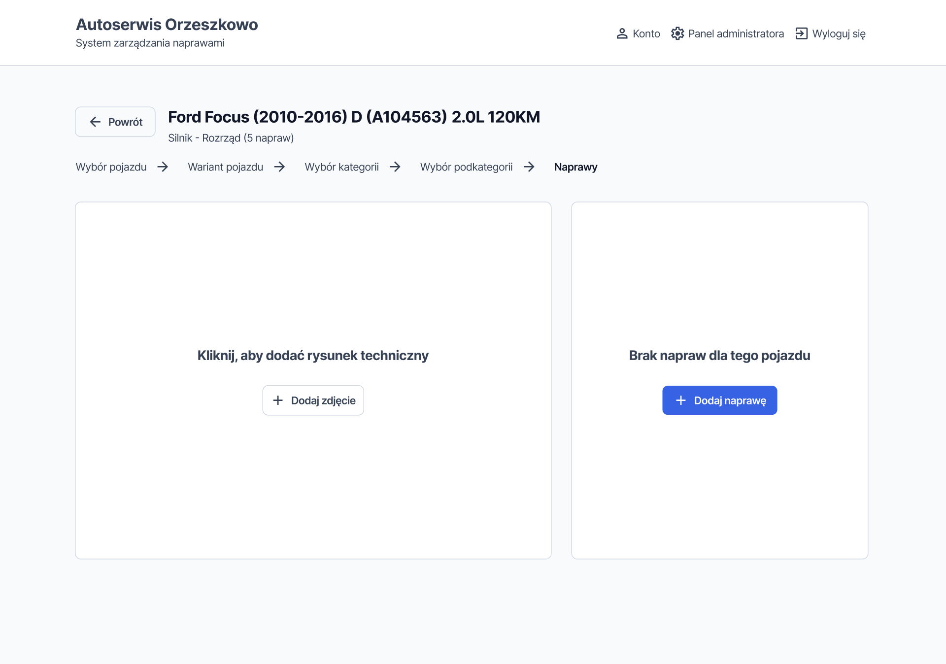
If any data (diagrams or repairs) is not updated yet, we included visible empty states with buttons that suggest the main actions - without the need to access the admin panel.
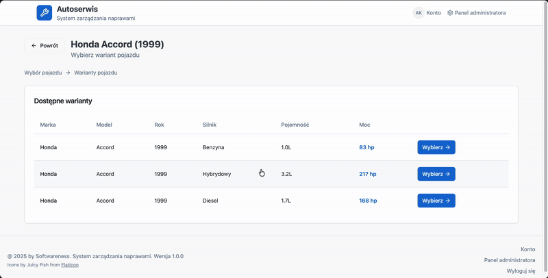
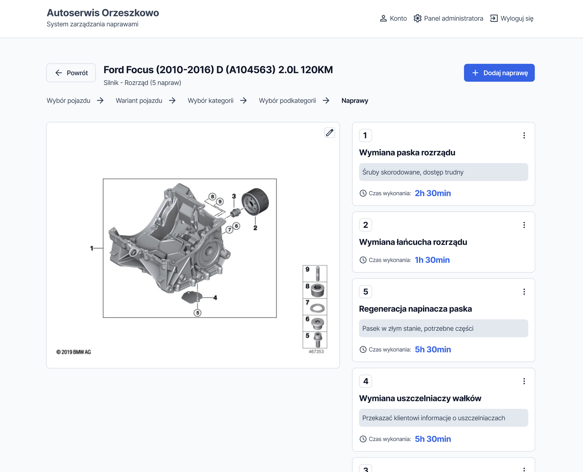
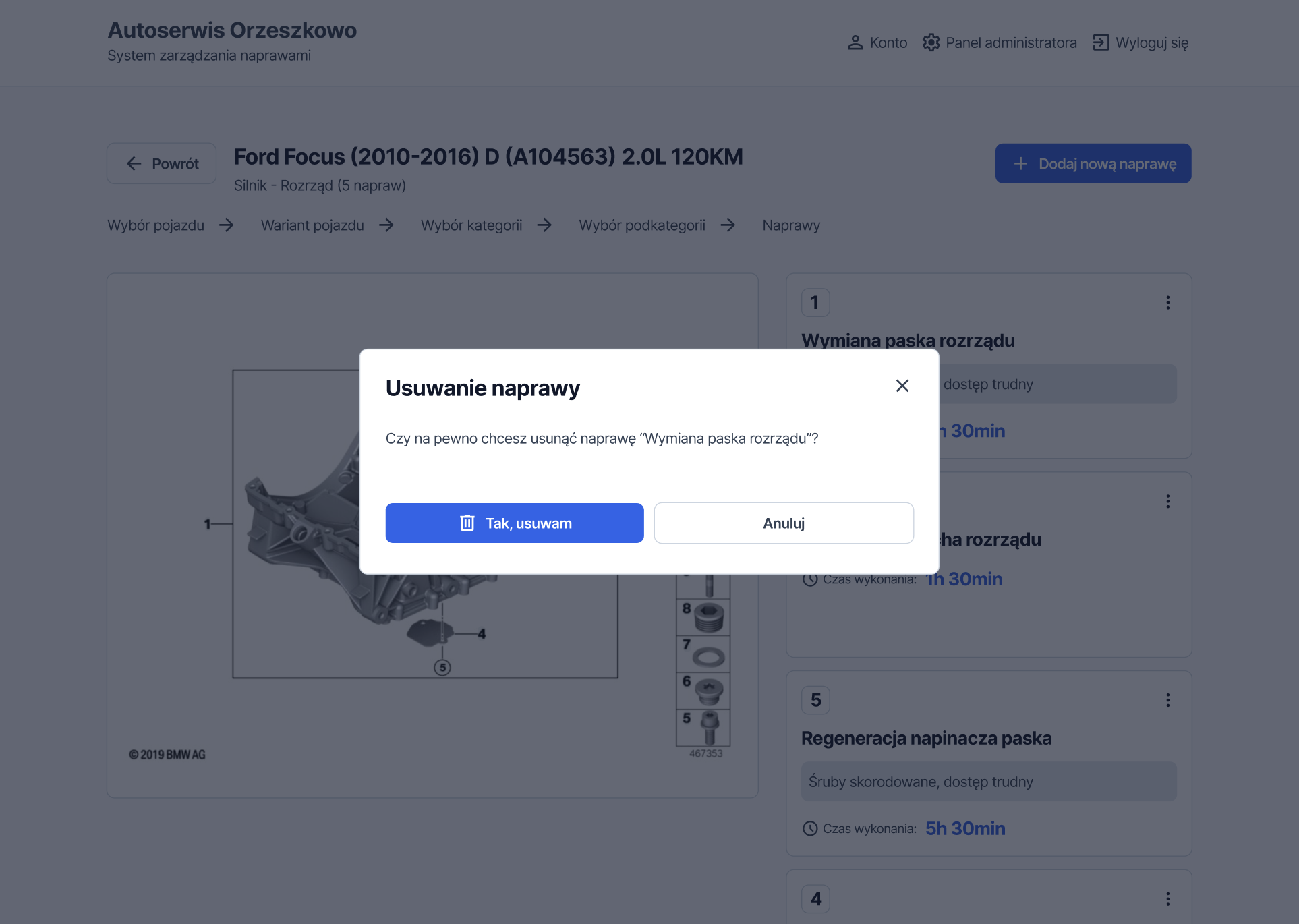
To make it easier to match the entered data with the technical drawing, we added numbers to the repair cards that correspond to the relevant locations on the diagram. The most important highlighted elements are the repair names and repair times; additionally, the mechanic can refer to notes intended for another employee or for the customer.
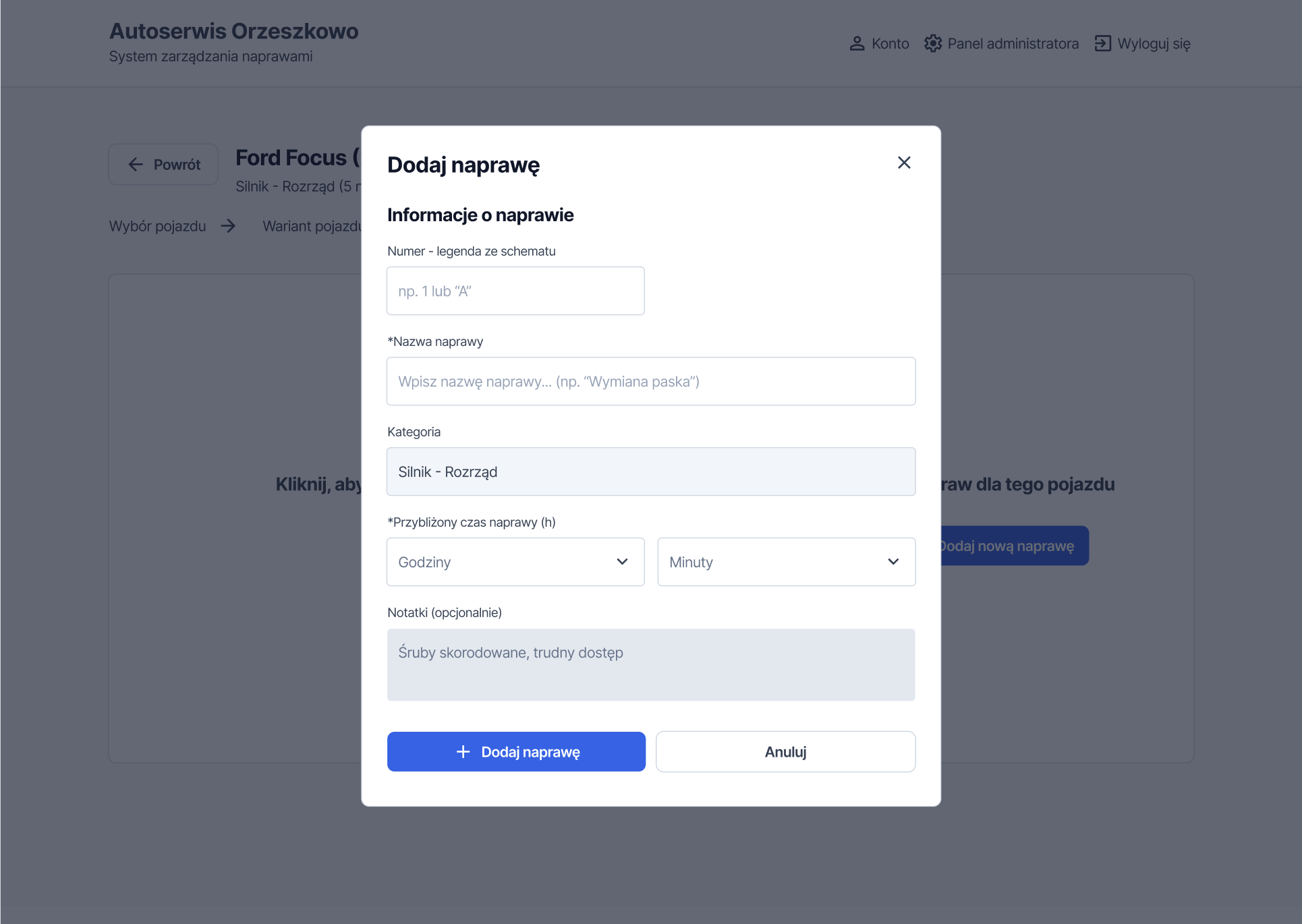
All repair data can be edited using a simple form that uses (*) to indicate which fields are required for saving changes, maintaining database integrity.
To prevent accidental deletion of repairs, we designed an additional confirmation modal before any delete action.
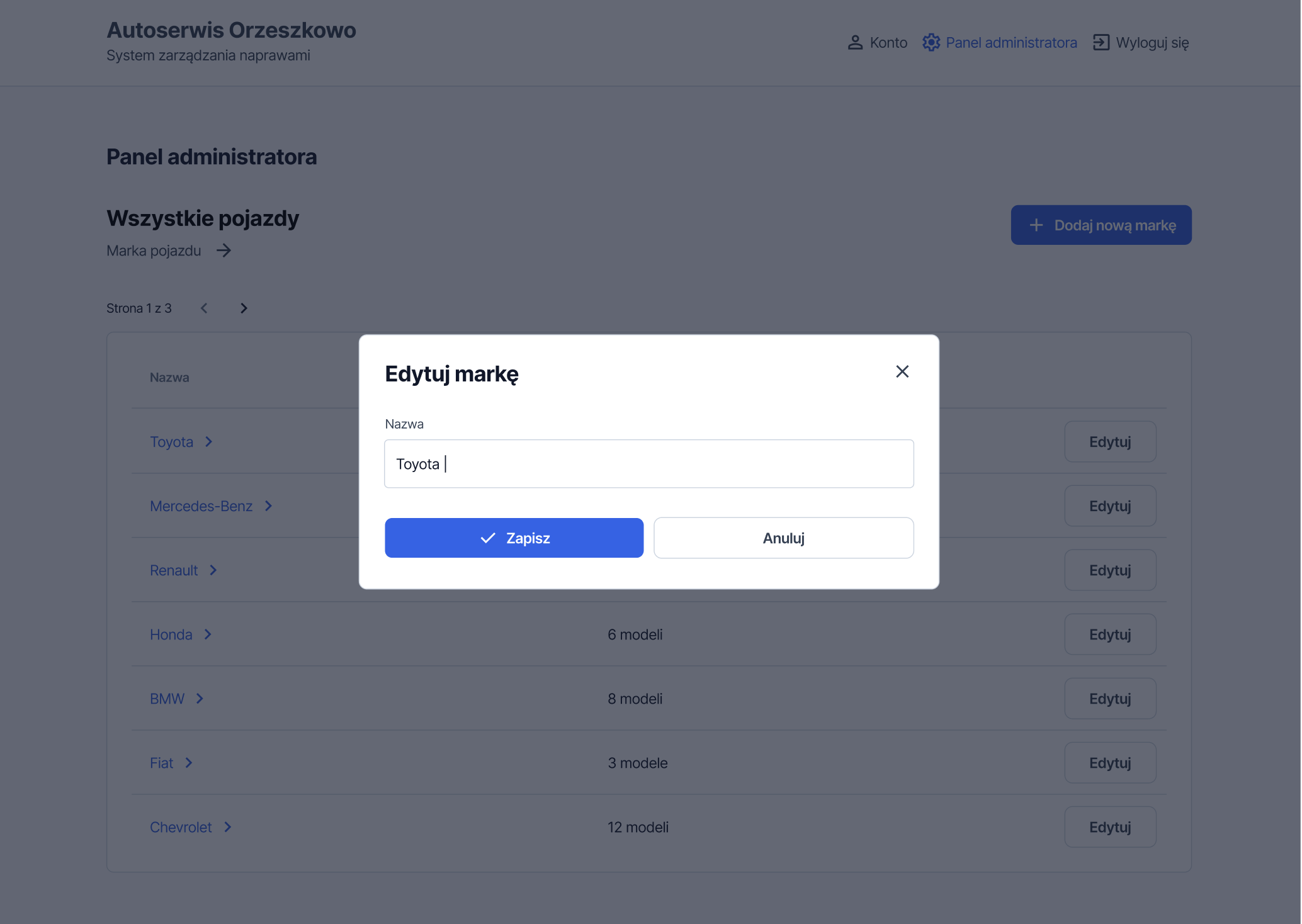
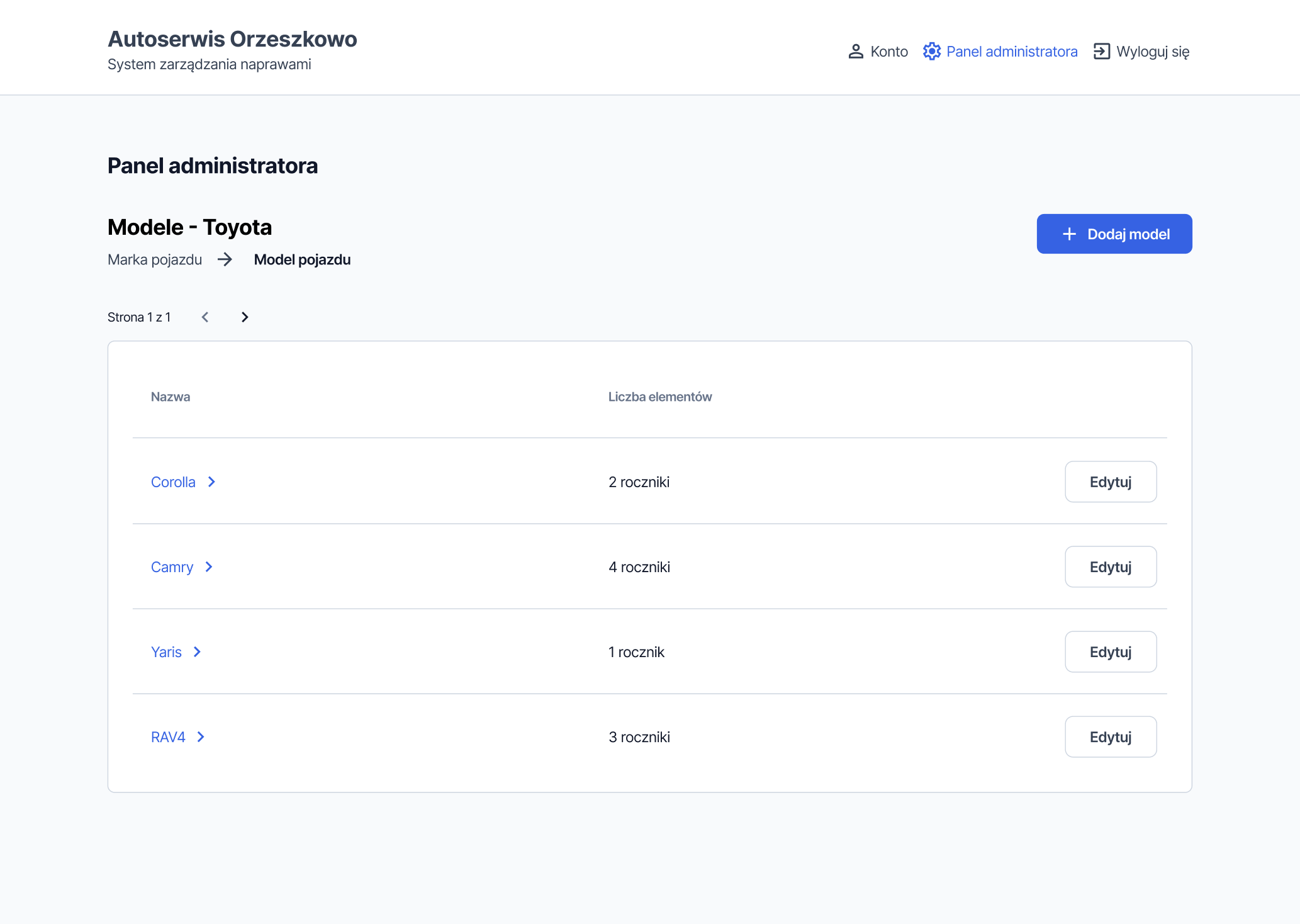
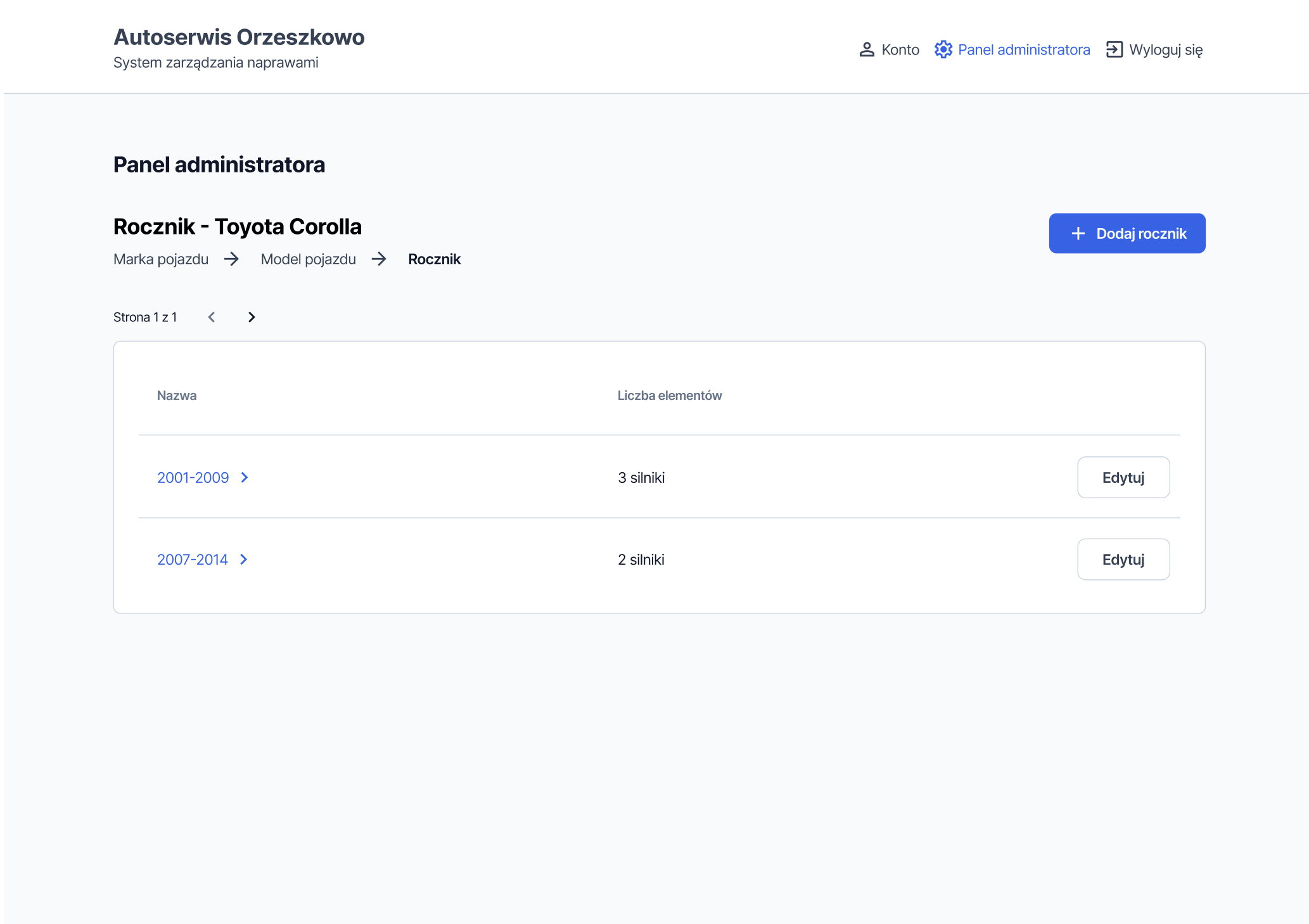
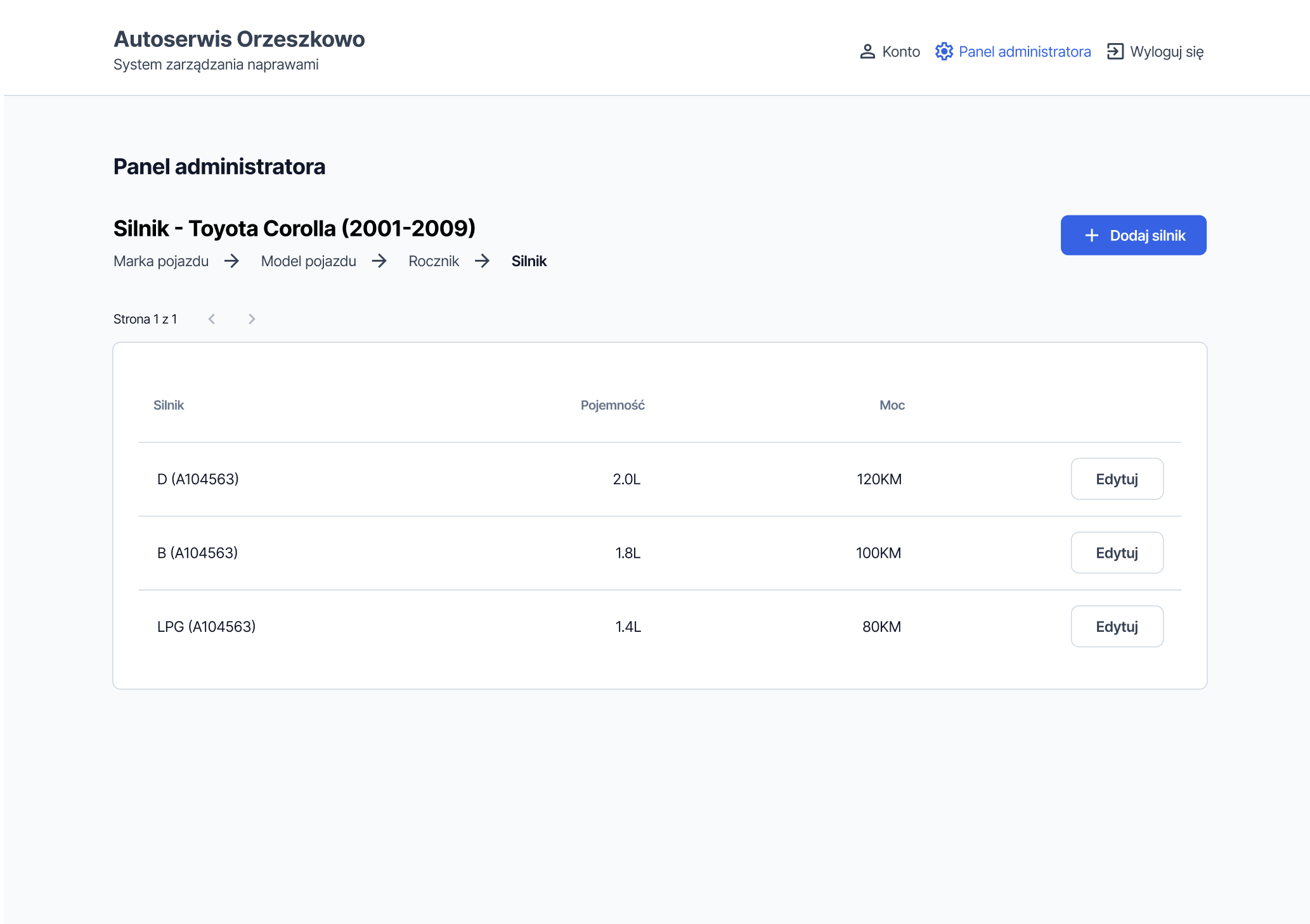
Admin panel
In the admin panel, a user with the administrator role can enter vehicle models, the model year, and the engine type. This data forms a vehicle database, which can then be accessed in the workflow shown above and used to assign specific repairs to the vehicles.
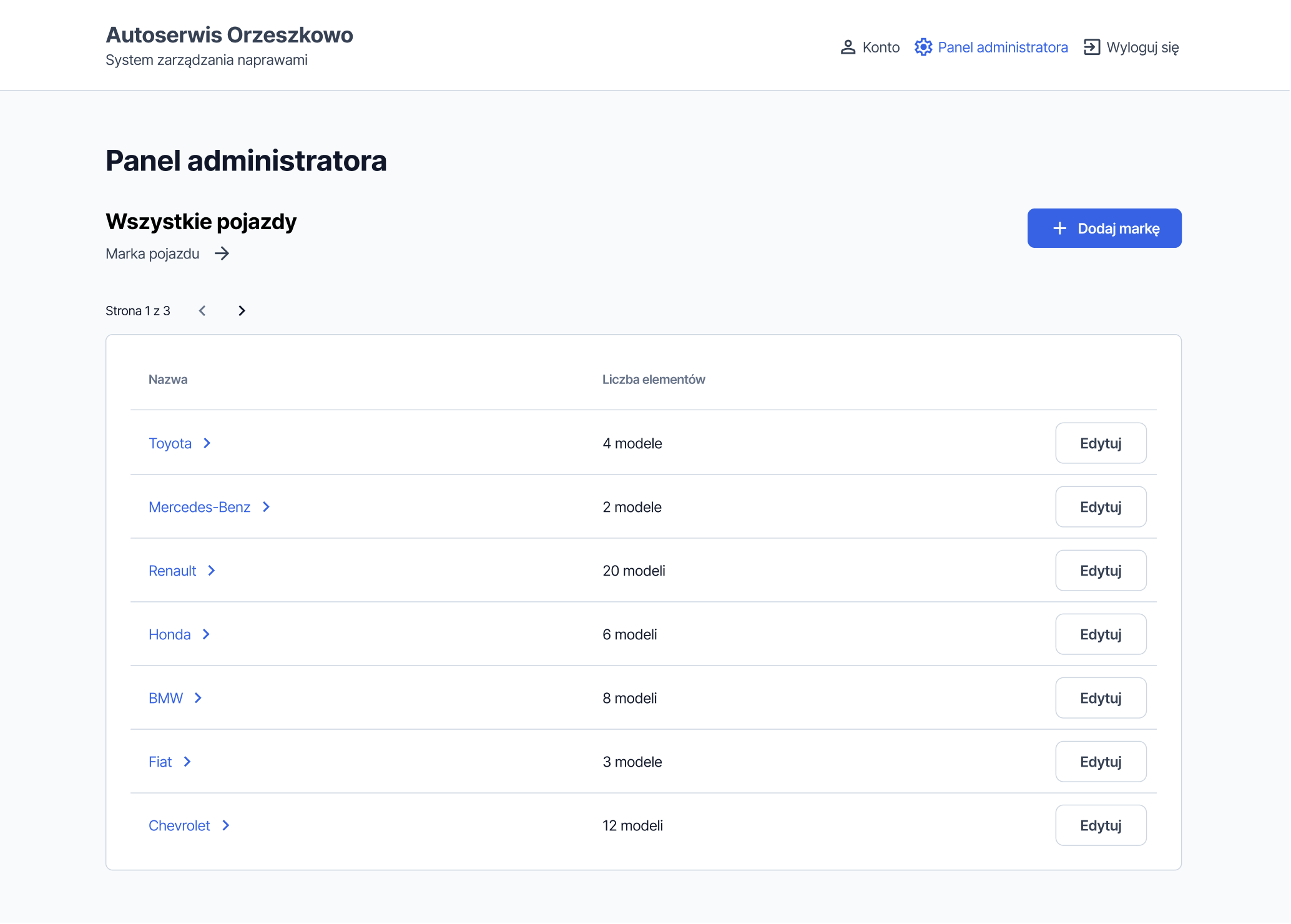
The table displays additional information such as the number of models or model years for a given entry, giving the administrator a quick overview of database completeness.