Minimalistic, aesthetic and highly SEO oriented e-commerce design.
Migrating to Shopify from Squarespace to simplify selling process, while building new e-commerce design for premium quality furniture brand.
Overview
A platform migration and full store redesign for a Polish handcrafted furniture brand - built around SEO-aligned information architecture and a design language that earns a premium price. Switching to Shopify was intended not only to address usability and day-to-day sales operations, but also to improve the aesthetics and UX of the store itself.
Situation
The project started as a platform migration, but at the same time became a rethinking of how the store communicates, converts, and positions itself for long-term organic growth. And of course a new design concept.
Main problems mentioned in brief were:
- Payment configuration issues - the existing payment setup was causing recurring problems such as: blocking transactions, generating incorrect invoices, and limiting available payment methods.
- Shipping options not fit for purpose - shipping configuration on Squarespace was inflexible, not meeting the practical needs of a furniture business with specific delivery requirements.
- Graphic and stylistic inconsistencies - beyond the technical issues, the existing design had accumulated visual problems as elements misaligned with the brand’s premium positioning and aesthetic direction. The store didn’t communicate what the products actually were.
Research findings - from a design and SEO perspective:
- homepage lacked proper structure and more information about brand or collections
- there were a limited number of subpages (considering SEO requirements)
- product detail page (PDP) did not contain rich content that would support sales and/or help customers choose the right product - with text only variants (especially since Lakehouse Pieces offers product customization such as color of the wood or the handle material)
Task
Migrate the store to Shopify. Redesign the full e-commerce experience - homepage, collection pages, product detail pages - with SEO structure built in from day one.
Strategy before screens
Before opening a design file or making any decisions in visual terms, during the first call we discussed the brief with project scope including SEO strategy with a specialist from client side. Main goal was to understand what the design would need to support in terms of optimization. The specialist subsequently delivered a full brief: information architecture, subpage structure, URL slugs, keyword clusters, and content requirements. My job as a designer was to translate it into shop architecture and design decisions.
That sequencing mattered. In most projects, SEO arrives post-design as a checklist of fixes applied to something already built. Here, the IA and URL strategy were defined before I designed a single section. With this approach I could build the right containers from the start, rather than retrofitting them later to fit copy or images.
New design requirements
The client’s design directive defined the visual language before I defined the layout. It was important to make it visually aligned to branding, current digital presence and Instagram account:
“We’re looking to the past, not the future.” - no rounded elements, no elaborate animations.
Translating that into a Shopify store meant actively resisting the platform’s defaults - its rounded corners, promotional urgency patterns, and modern e-commerce components. I wanted to combine the previous shop idea with a more structured layout, in favor of something quieter and more editorial.
Project trade-off - working within constraints
Shopify is a template-first platform. That’s a constraint worth naming clearly, because it defines which design decisions are actually available. In many cases customizing off-the-shelf solutions or modifying default elements can be more time-consuming than building something from scratch.
A fully bespoke theme would have offered complete design freedom. It would also have been unmaintainable for a solo craftsperson without ongoing technical support. It could also build risk for a launch-focused project. Template approach meant accepting certain structural constraints in exchange for long-term sustainability. The design work, then, was about maximising what was possible within those constraints.
Selection was a broad research process: I evaluated themes against the design brief (no rounded elements, editorial aesthetic, premium positioning), the SEO requirements (semantic HTML structure, heading hierarchy, performance), and the practical reality that the client would manage the store independently after launch.
Result
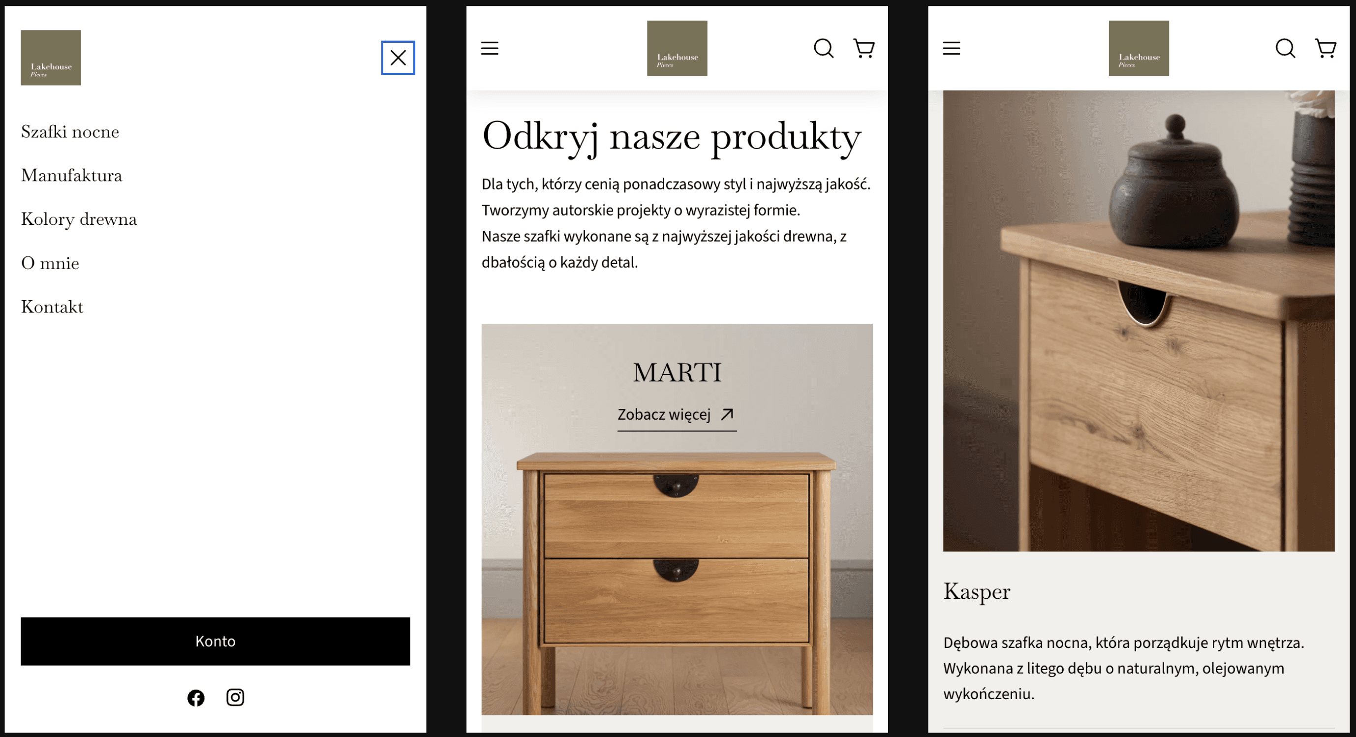
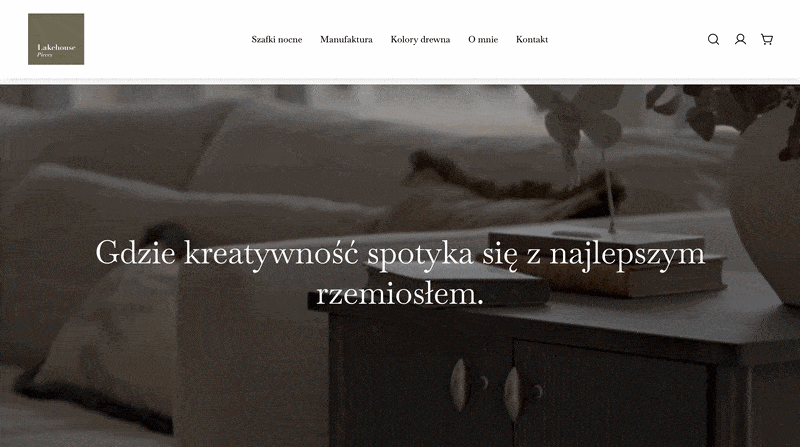
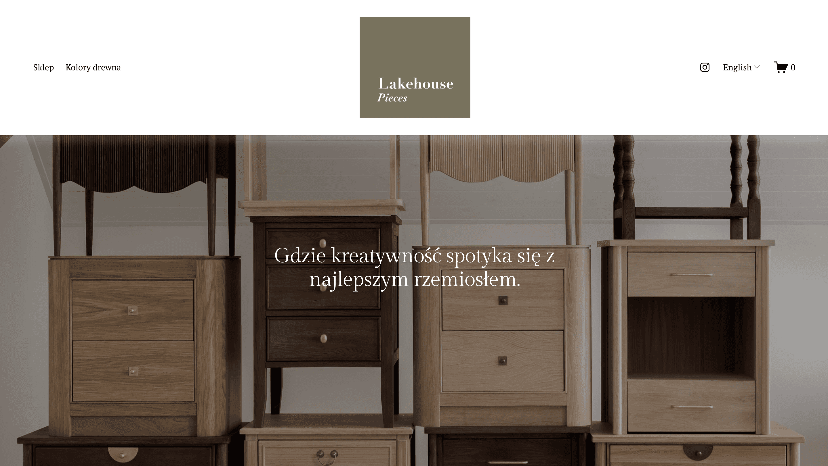
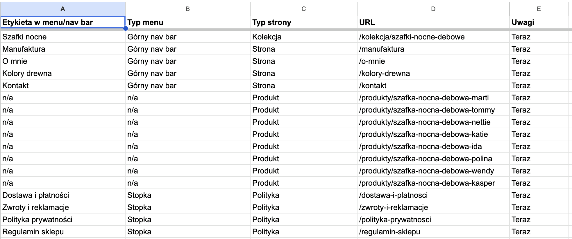
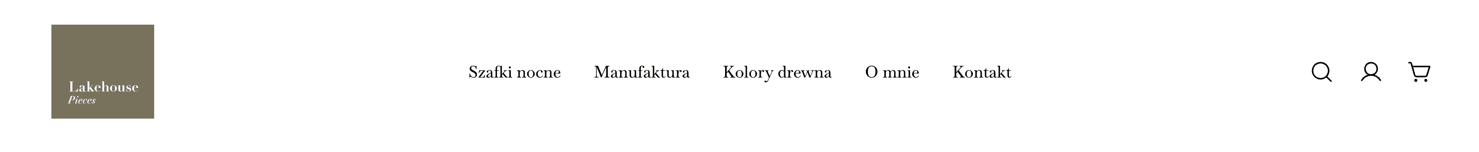
Navbar
The store’s new information architecture includes not only pages featuring the current product collection, but also storytelling elements (Manufaktura) and sections to help customers choose furniture (Kolory drewna). In addition, there are standard “About Us” and “Contact” pages, which simultaneously help improve the site’s Google search rankings.
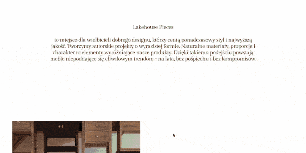
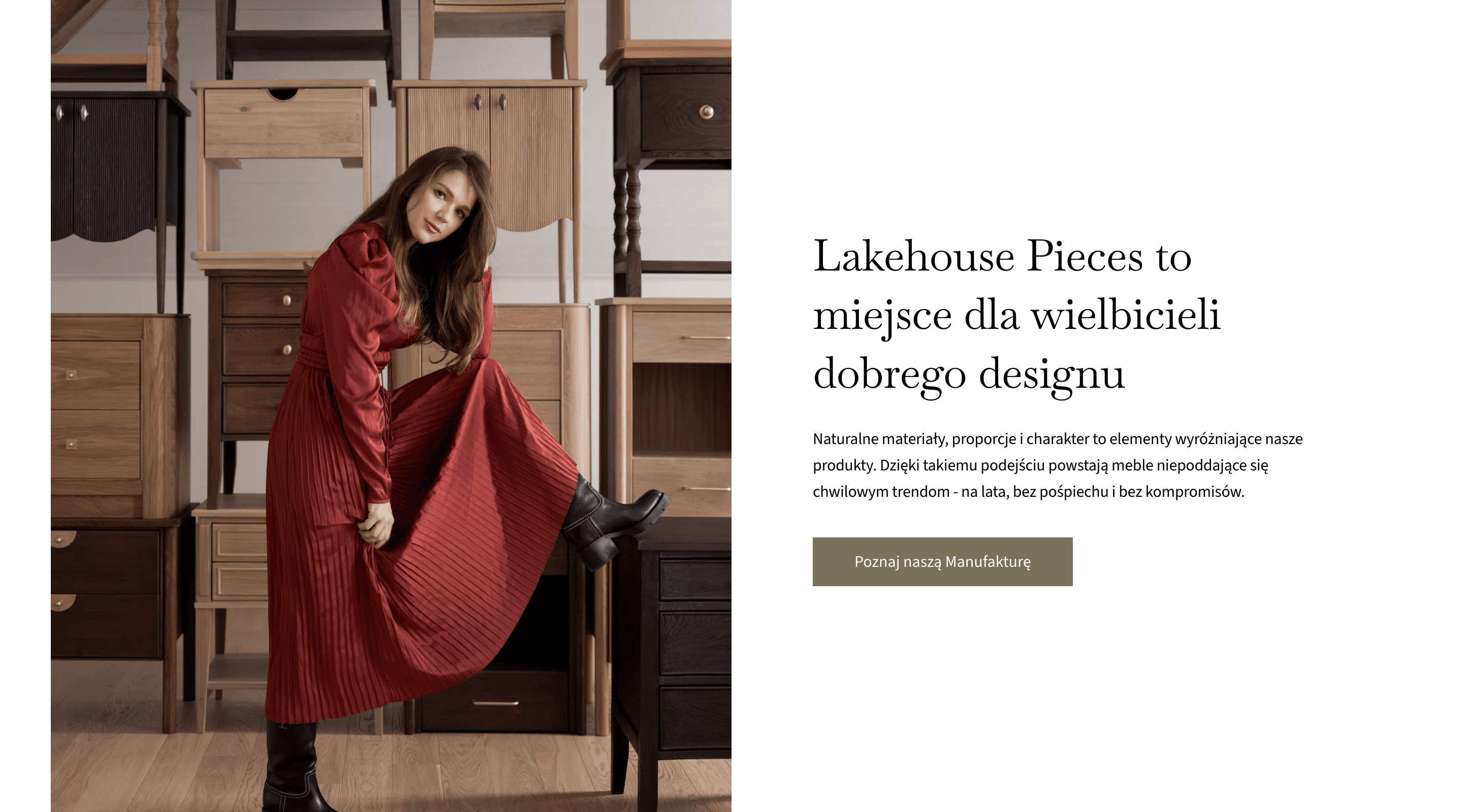
Homepage
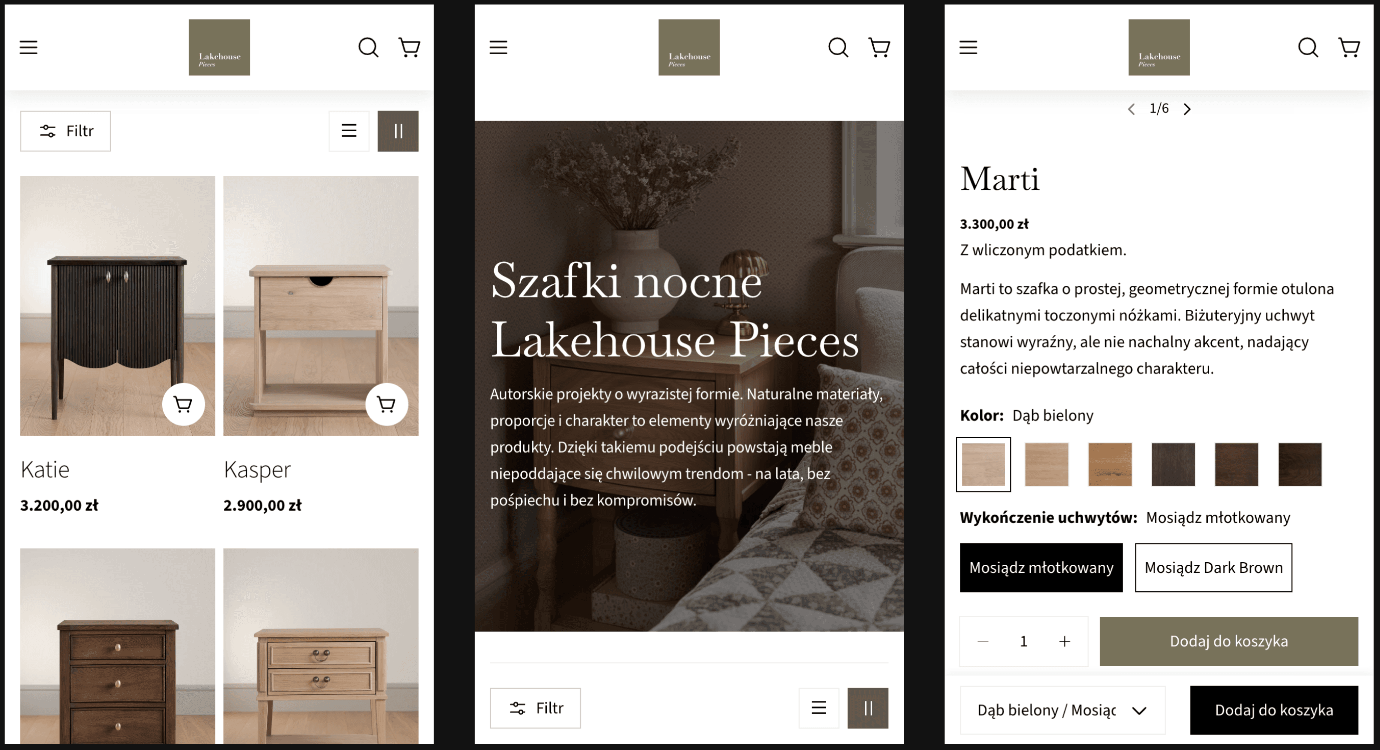
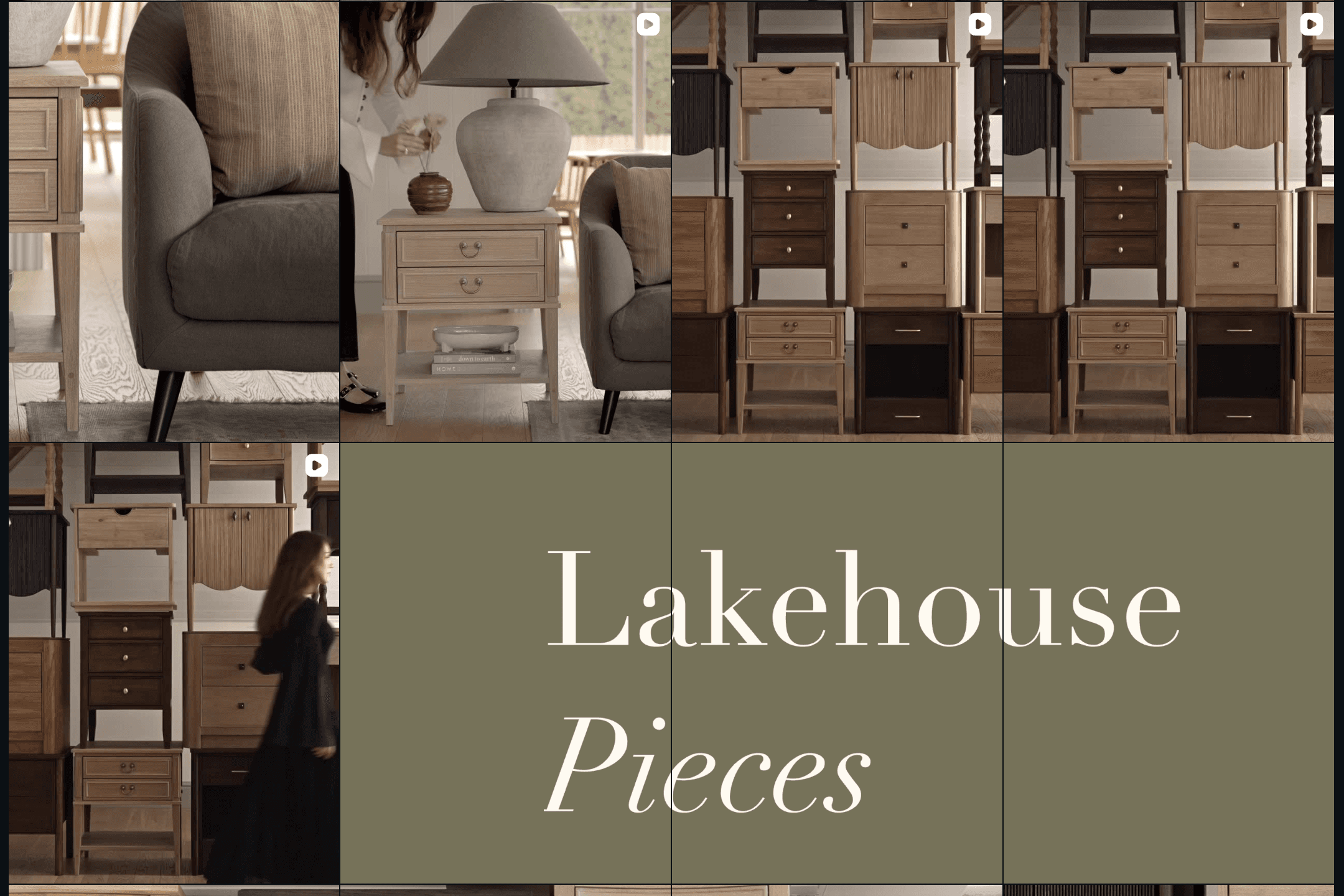
The previous hero section was replaced with a photo carousel - a standard feature in online stores. In this case, I didn’t experiment much with the visuals; instead, I focused more on the sales aspect. This resulted in highlighting specific products in the hero section as well as redirecting users to subpages.
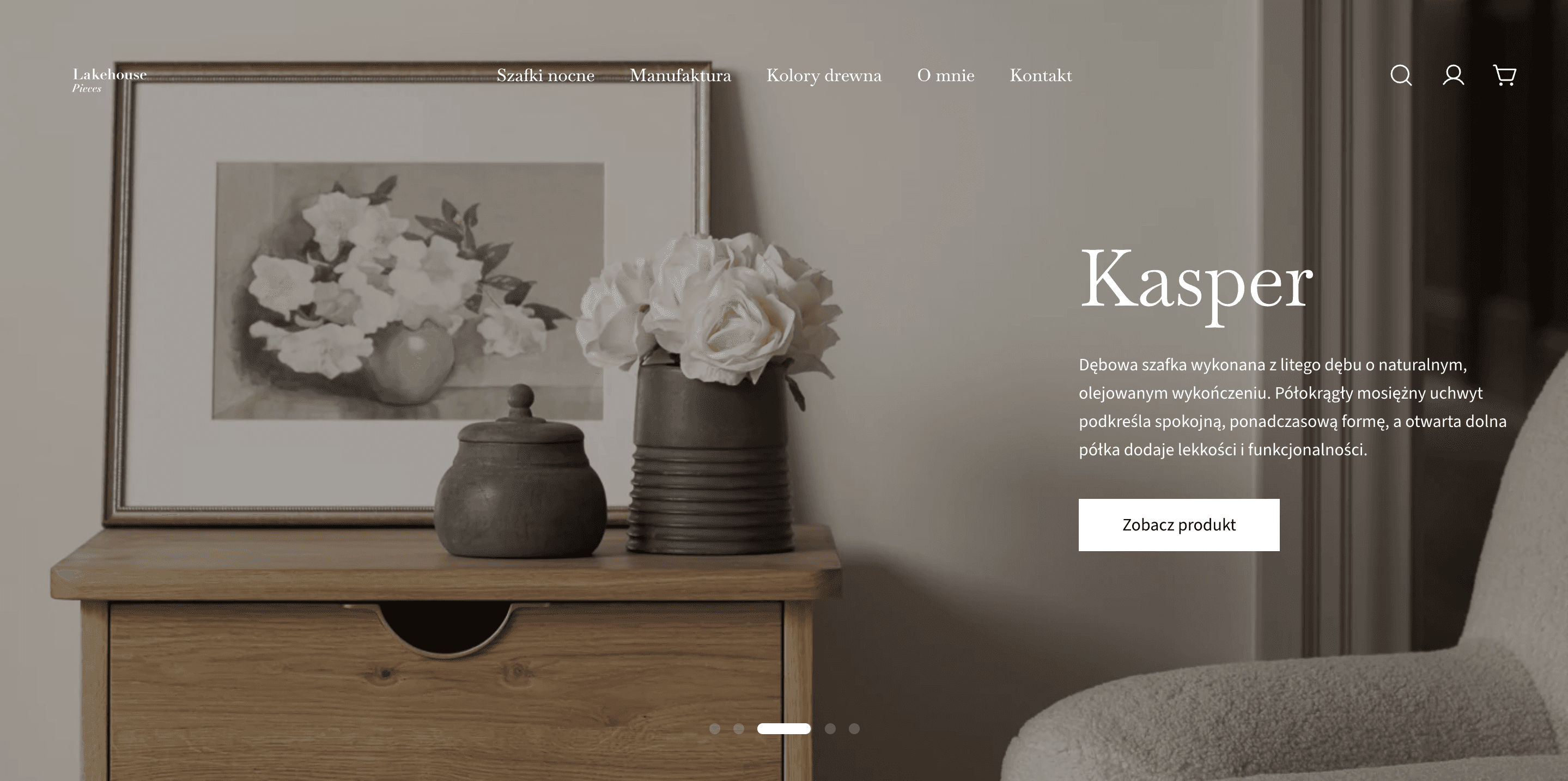
According to the sales strategy, the first highlighted section is a link to products from the current collection.
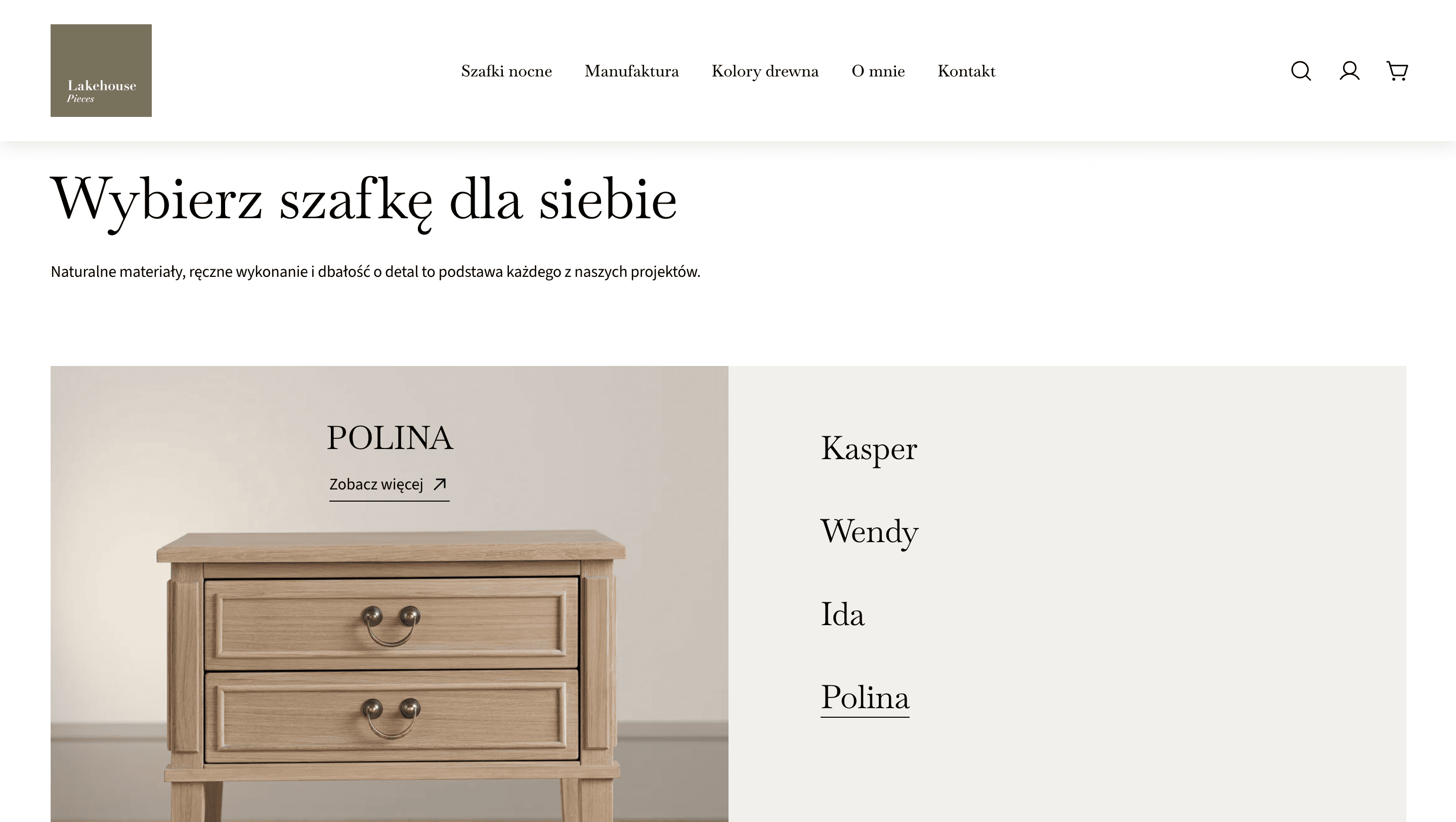
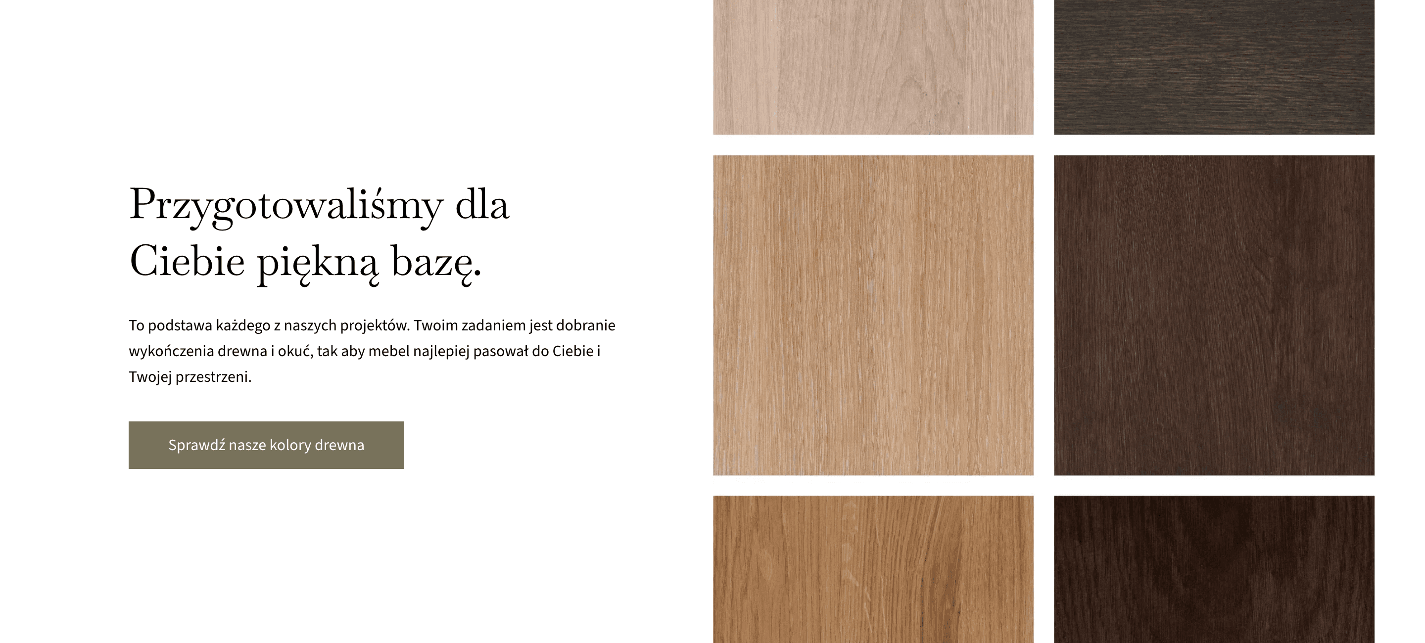
To build credibility and create a user journey focused not only on sales but also on getting to know the brand, the homepage features numerous sections that link to subpages providing more information about the company’s core concept and the types of wood used in production.
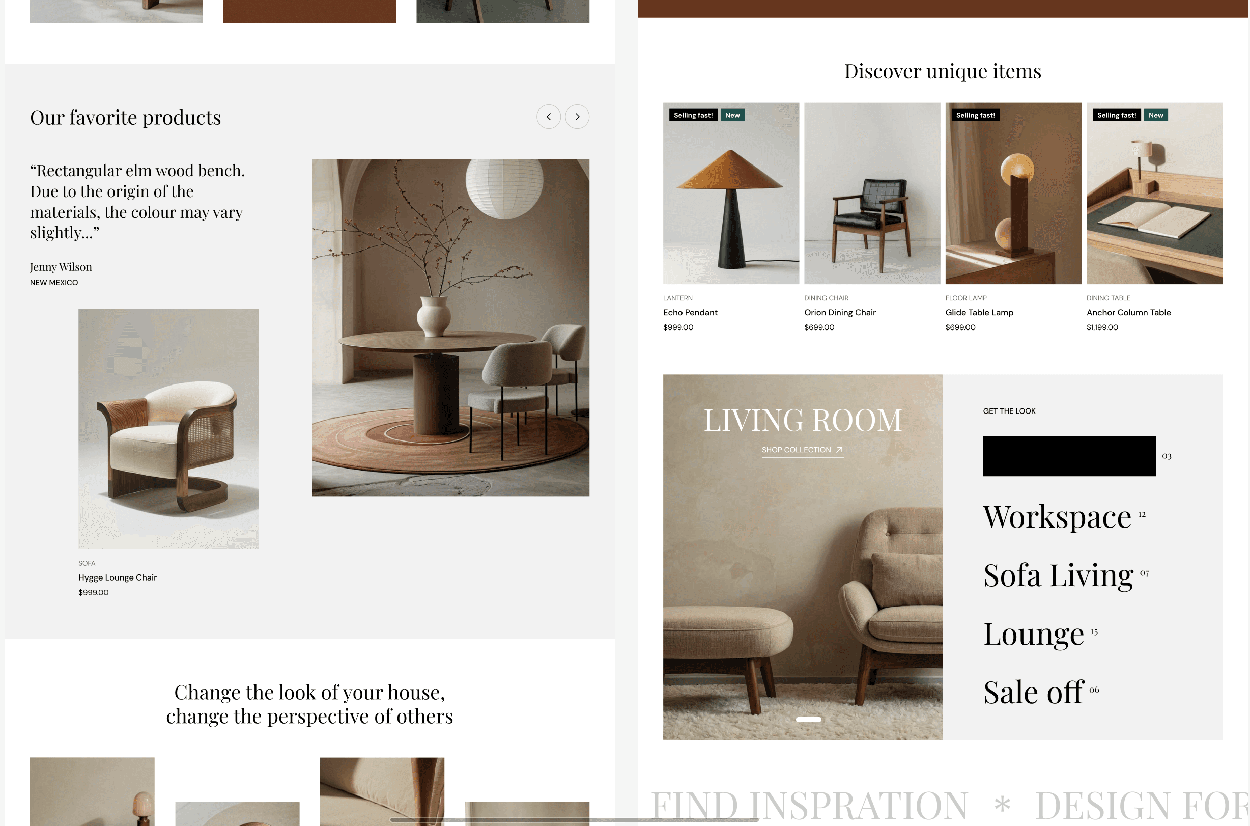
Homepage content is also accompanied with highlights of specific products from the collection, along with brief descriptions optimized for SEO. Every product in this section can be checked in quick view option, where you don’t have to go to the PDP for more information.
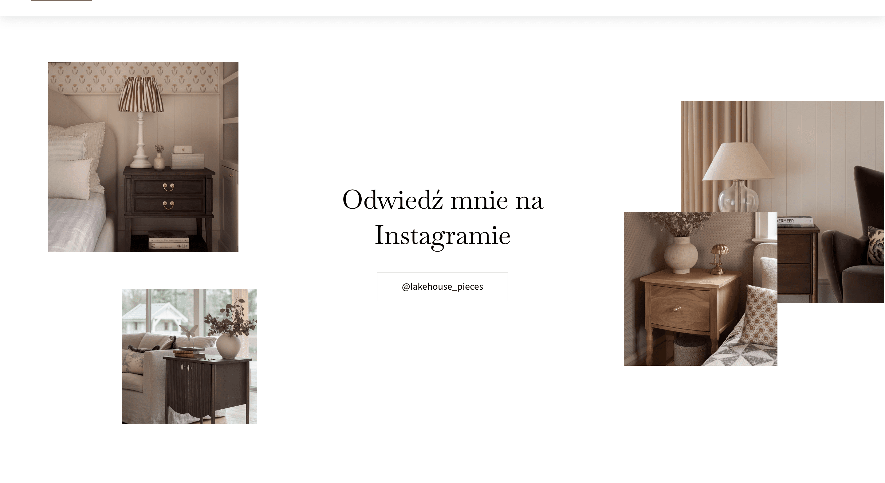
To strengthen personal brand, I included a link to Instagram to help expand the reach of the business among those who have visited the store but are still looking for inspiration or confirmation of brand professionalism.
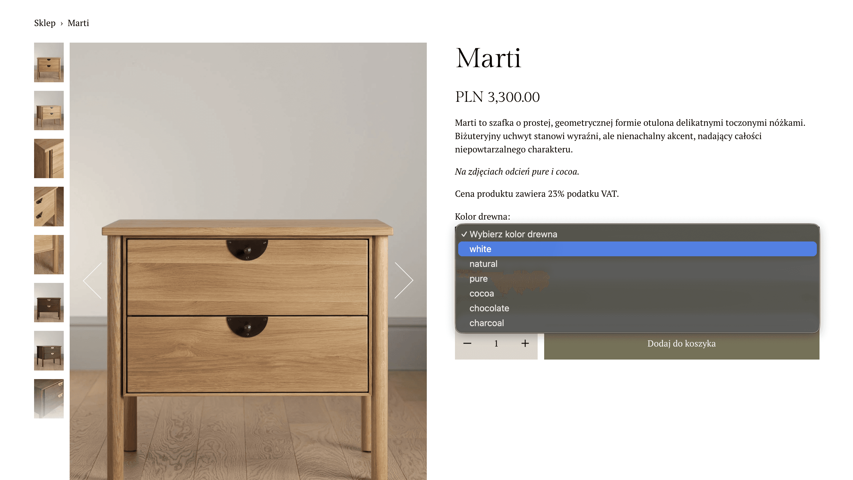
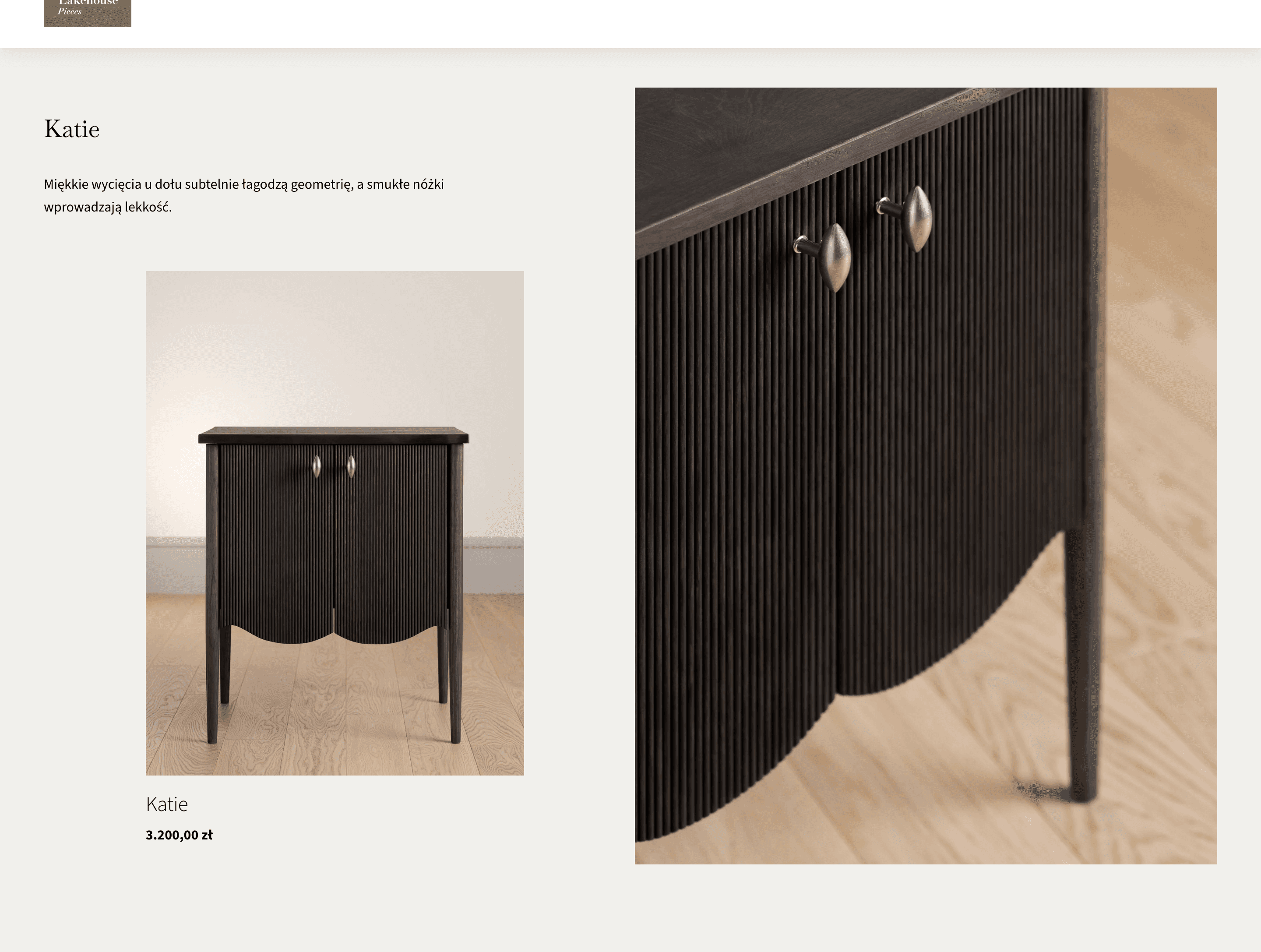
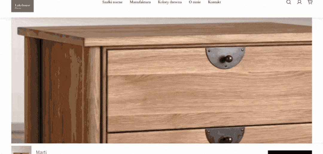
PDP
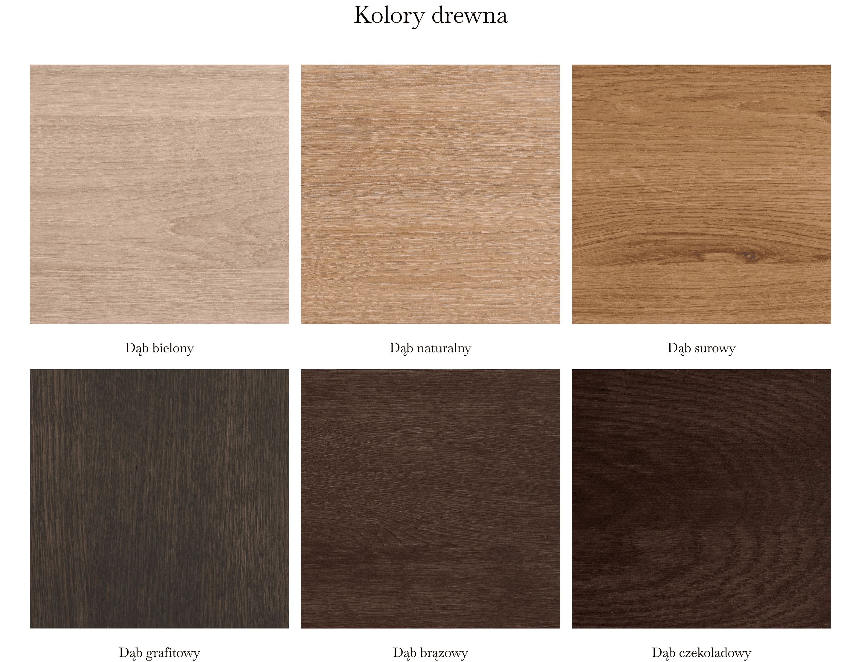
In the new version of the store, wood color options are no longer displayed as a dropdown list, but as color swatches - easy to distinguish and help guide the customer’s journey during the decision-making process.
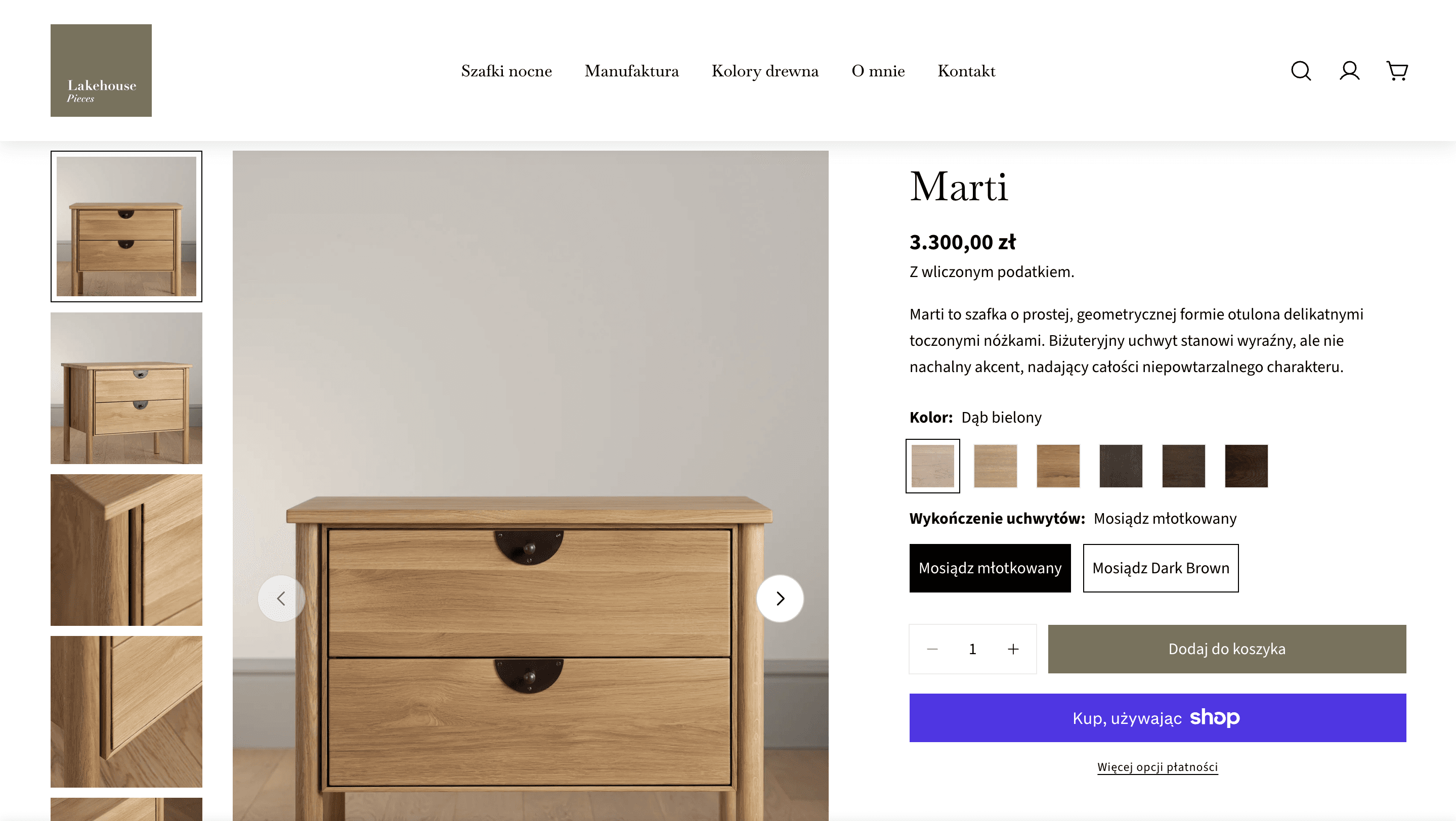
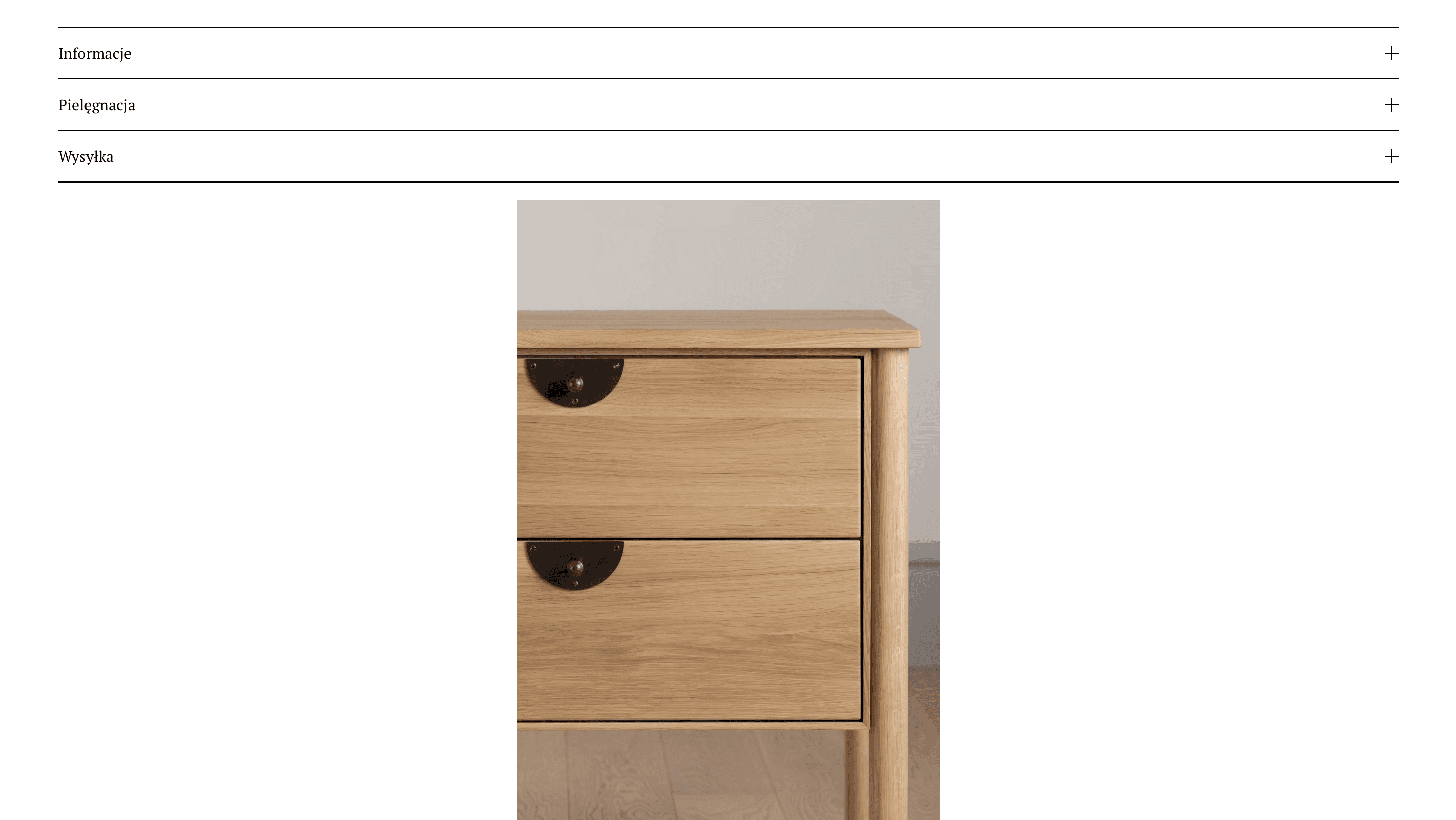
Next element that serves both promotional and aesthetic purposes - a looped video showcasing the product.
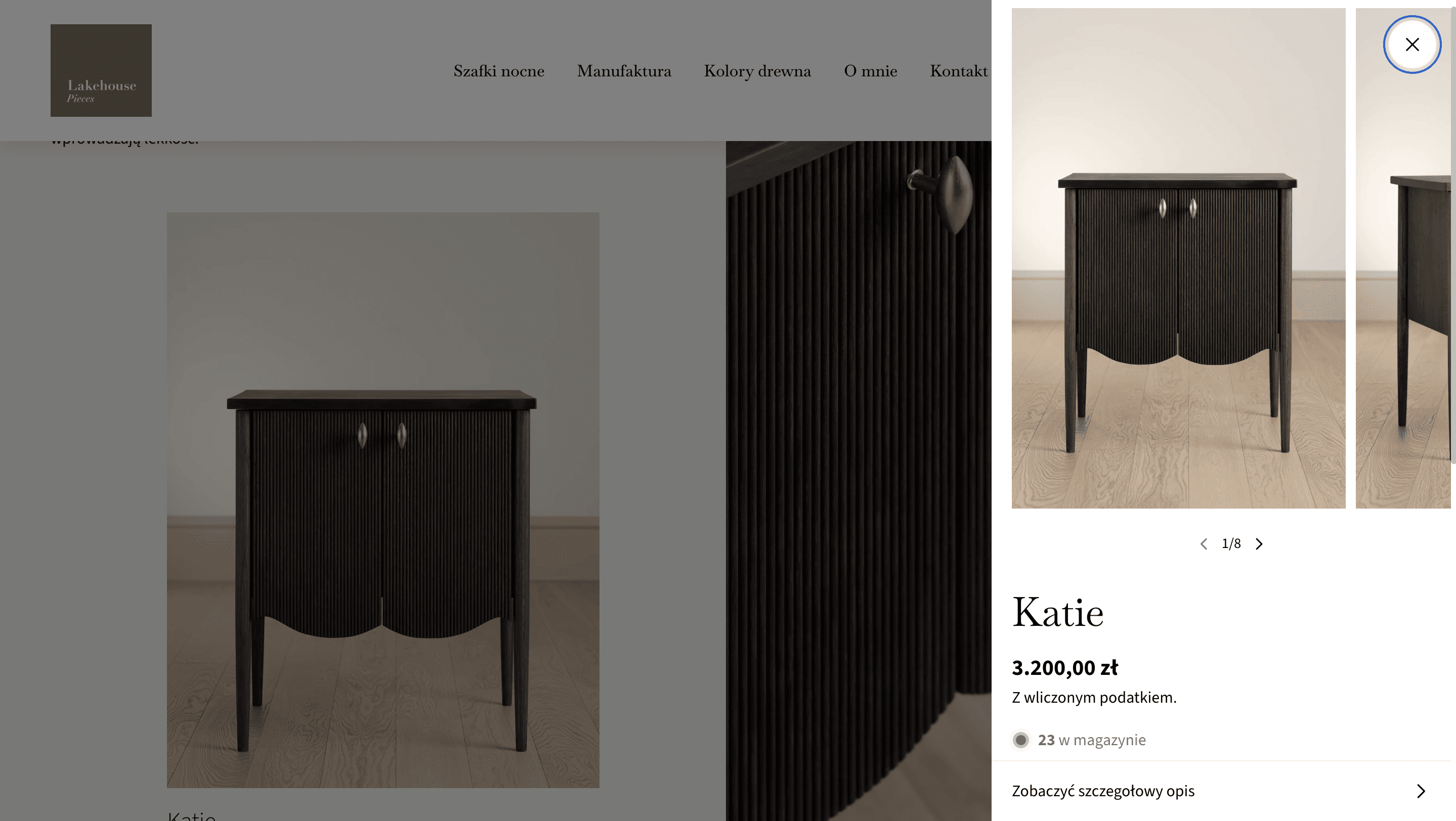
If the user is unsure about the selected wood color option or would like to see the options up close, they can view the color options again in an enlarged section later - which helps prevent making mistakes during shopping.
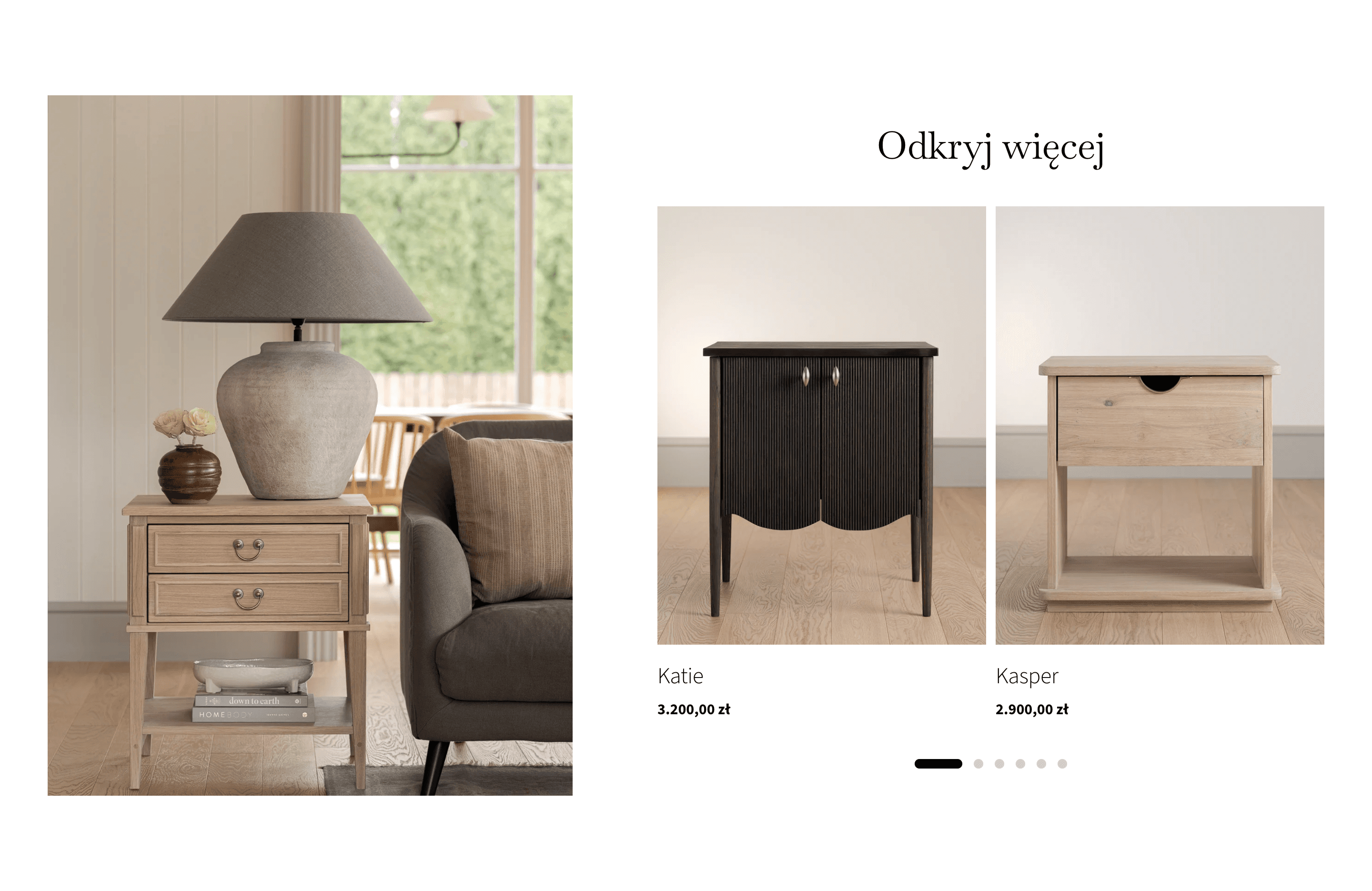
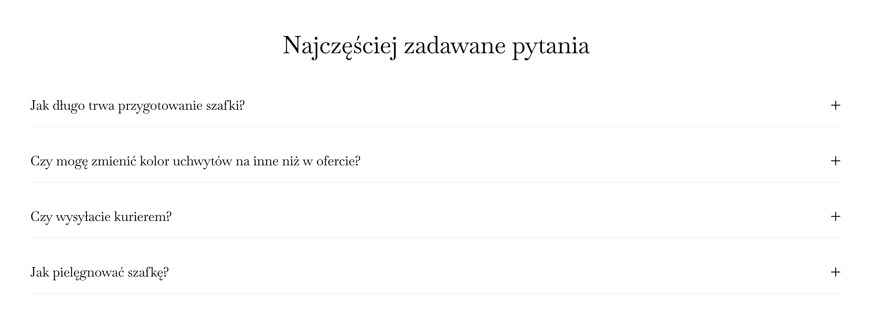
The completion of the PDP includes recommendations for other products and frequently asked questions.
Mobile views
The store is fully responsive, with scalable images and desktop features adapted to breakpoints.