Web design, prototype and development in one tool
Origami Studio needed a website that would speak to potential clients without shouting. New website for a design studio delivered in Figma Sites.
Overview
Origami Studio needed a website that would speak to potential clients without shouting. The brief was elegance, restraint, and warmth - to showcase professionalism and experience in the design industry, but without creating an unnecessary barrier between the studio and potential clients. Goal was to avoid using flashy effects or complicated animations. This is how we turned that direction into web design. Project designed, prototyped and developed in one Figma Sites ecosystem.
Client: Origami Studio
Design collaboration with: Kacper Żukian
Situation
Most projects begin with a designer and a client on opposite sides of the table. This one had four designers - two of us building the site, two of us approving it. Justyna and Weronika from Origami Studio had more than enough eye to critique every single pixel, but we all agreed early on: they would act as clients. That meant focus on strategy, feedback, and vision - not on opening Figma and doing it themselves. That agreement kept the process clean and gave the work a clear author. Origami were the experts on what they needed, leaving us with the design part.
Task
Internal work
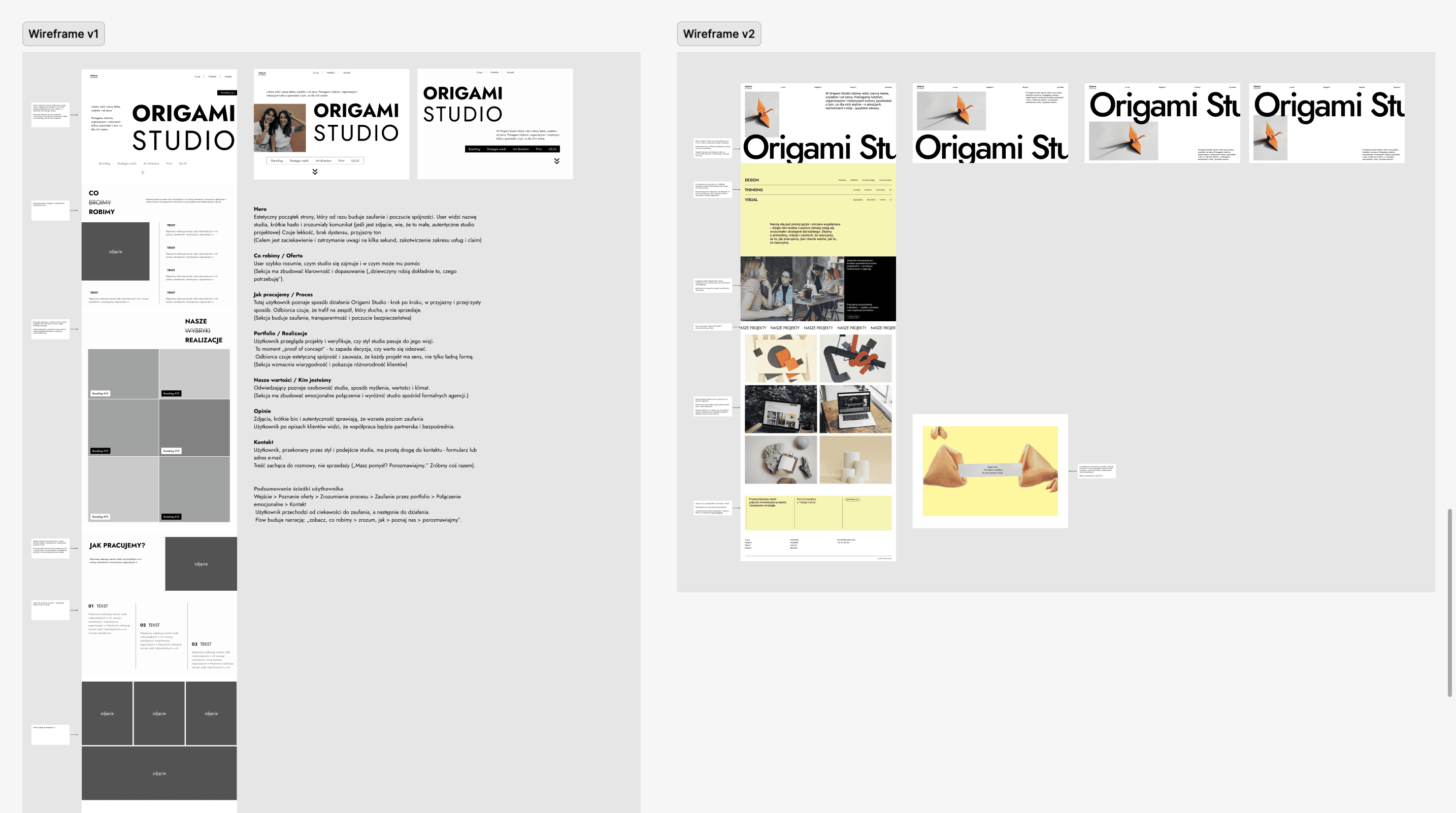
Before any screen was designed, Kacper and I sat down and agreed on a shared process. We would each prepare a homepage structure independently, then use the workshop with Origami to test both proposals against their actual goals. Main goal was to use the collision of ideas to find something better than either of us would have made alone - looking for balance between two approaches. The idea was to focus entirely on the structural layer at first and pay as little attention as possible to the visual layer, concentrating mainly on UX and information structure.
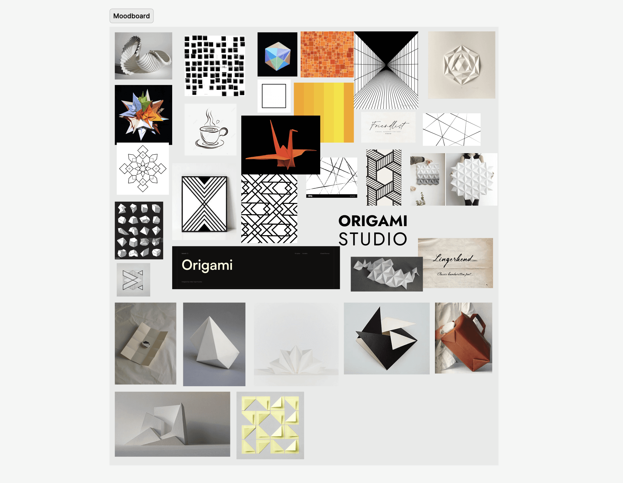
We also created a shared moodboard to draw inspiration for the next stages of the design process in parallel.
Workshop
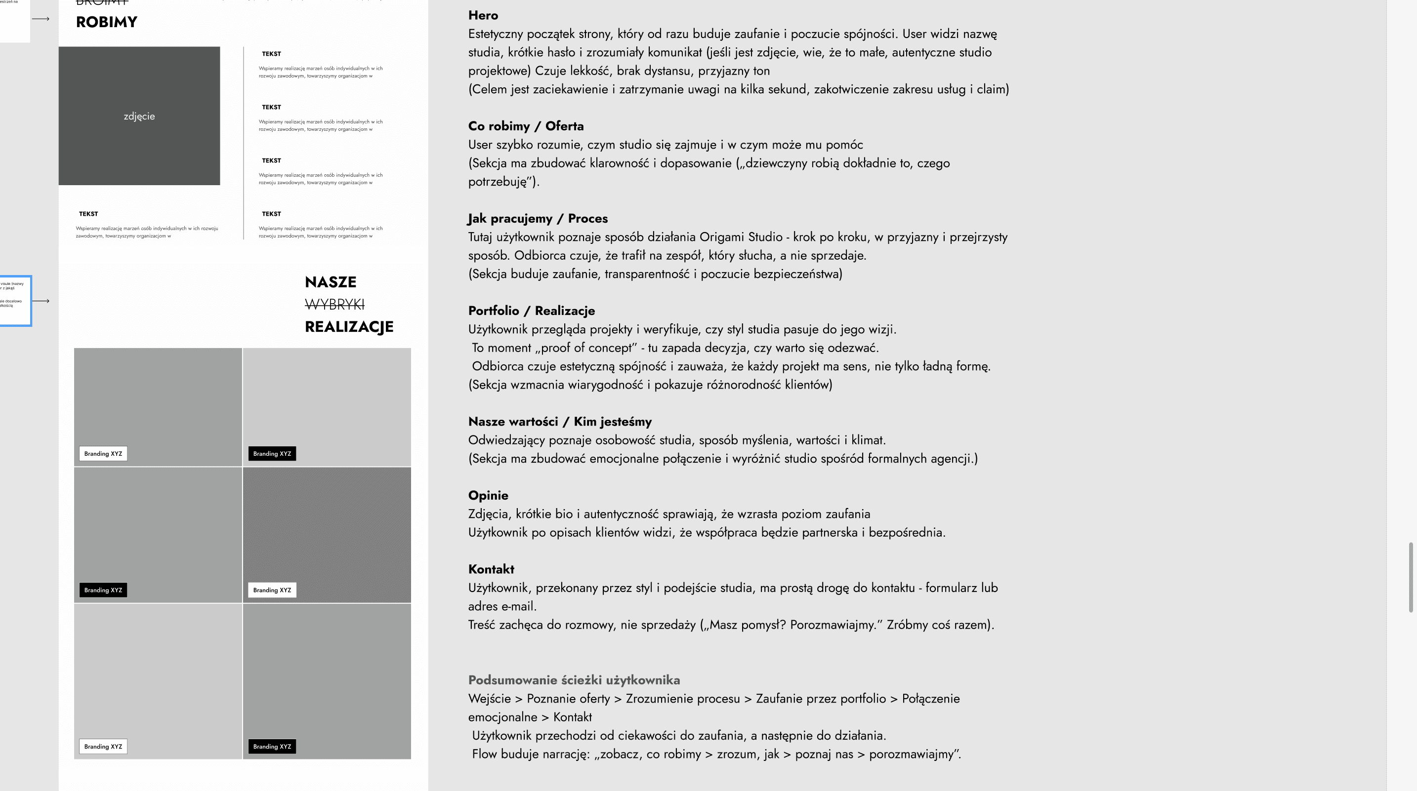
We ran a structured workshop before any visual direction was locked. The agenda was deliberately strategic: who visits this site, what do they need to feel, what action should they take, and what are the biggest barriers stopping them from taking it?
The target user is a potential client - someone who’s heard of Origami Studio, or found them through social media or word of mouth, and lands on the site wanting to understand whether these are the right people for their project. That user journey shaped everything: they need to quickly understand what Origami does, believe they’re credible, and feel warmly invited to get in touch.
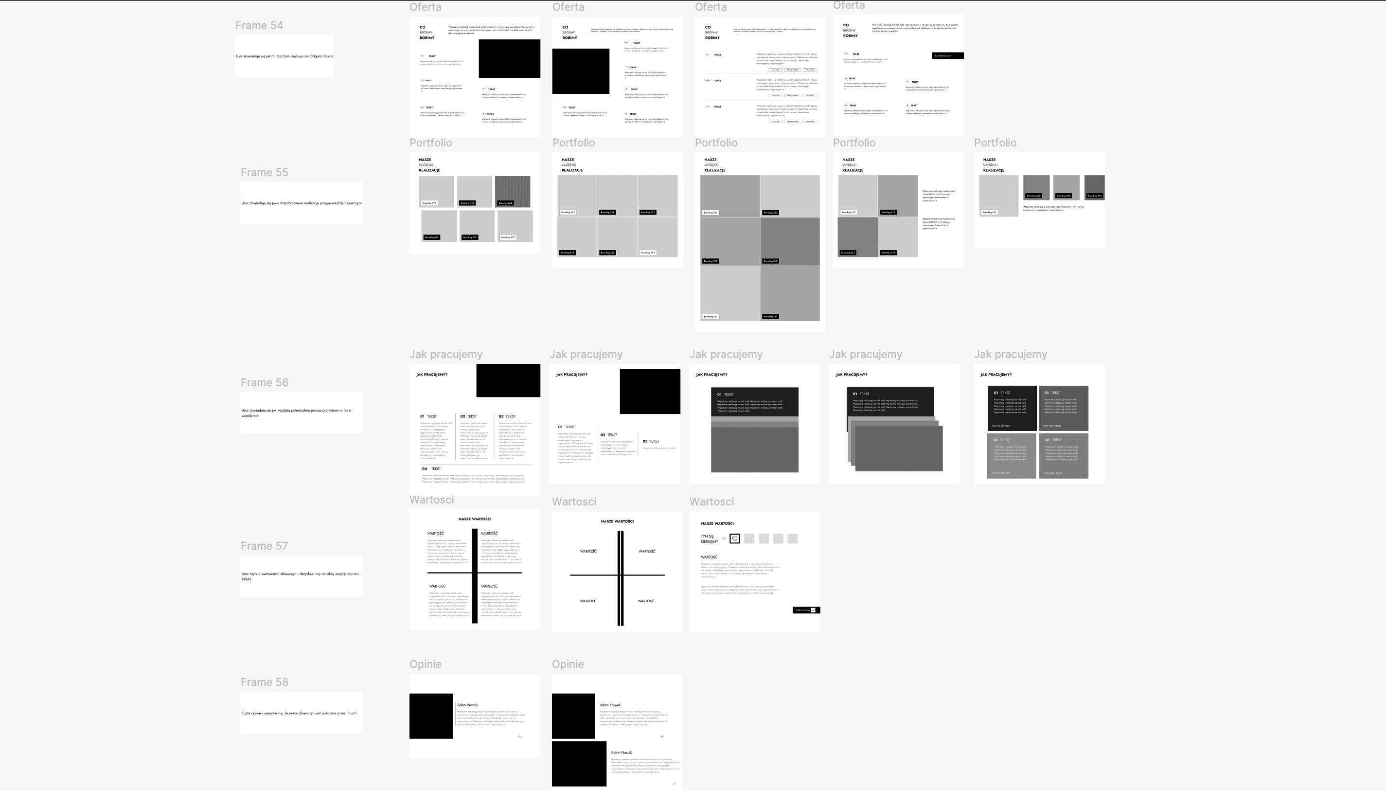
Once we had the strategic foundation, the information architecture followed logically. We debated the order of sections carefully - not as a visual question, but as a business one. What does a potential client need to know, and in what order do they need to know it?
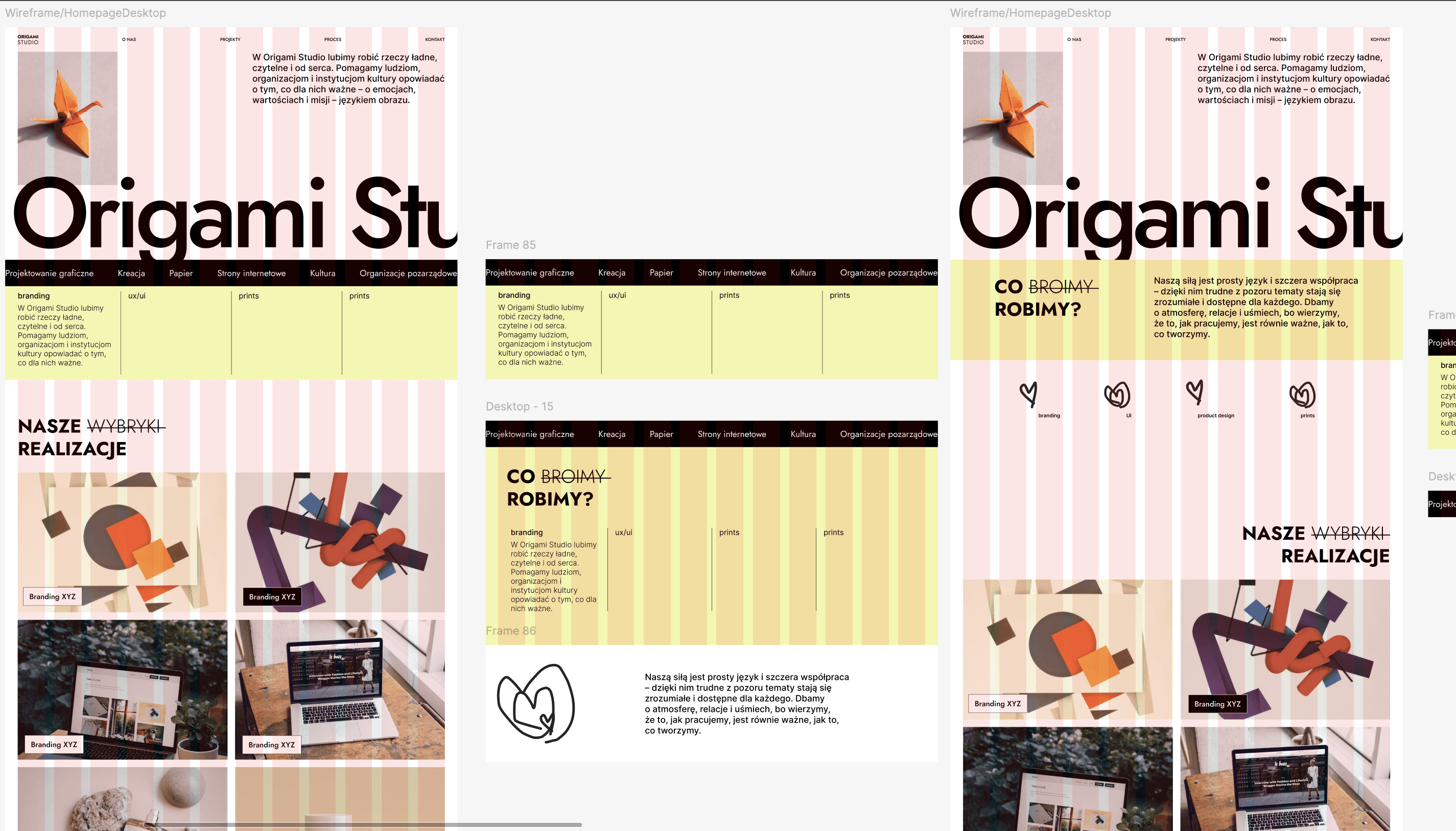
The homepage structure we landed on was sequenced:
-
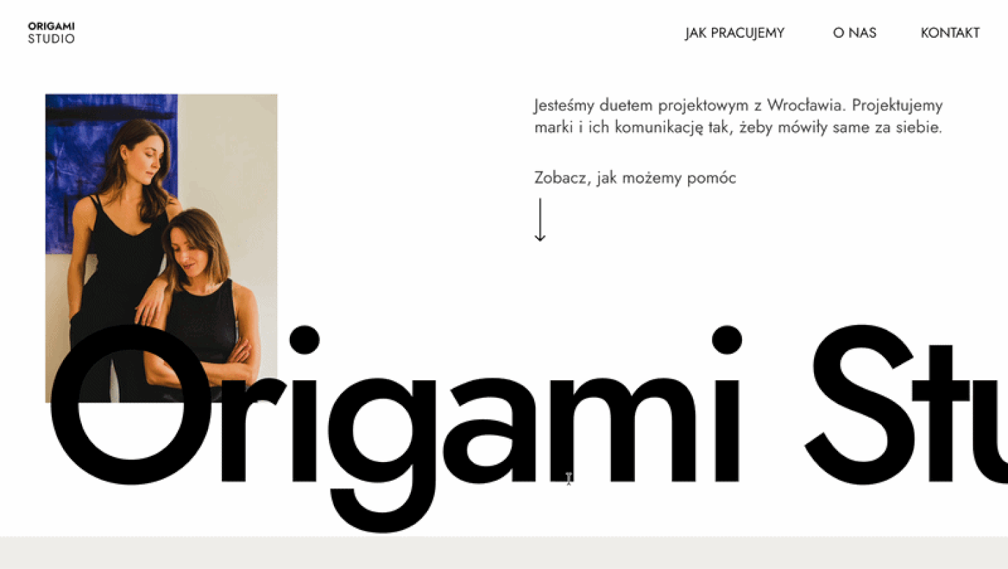
Hero + who we are and what we do (as a supporting text)
First impression. The tagline does the heavy lifting. No carousel, no video, no noise. -
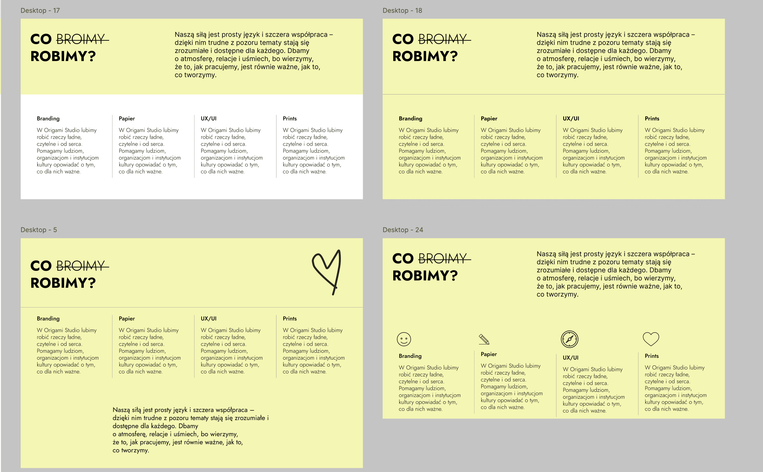
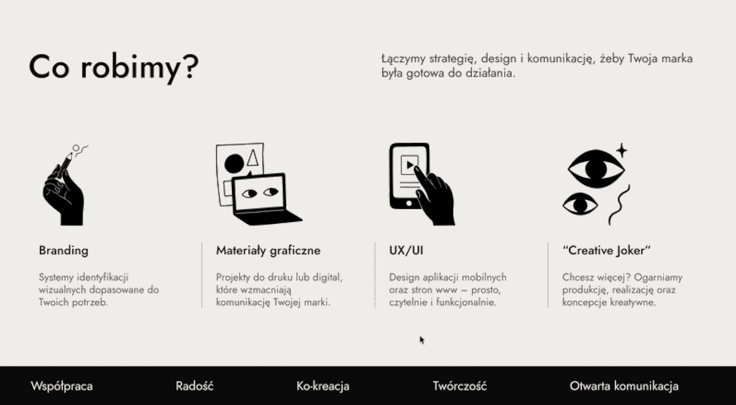
Services - what we do specifically
Key trade-off: putting services before portfolio was a deliberate business call. A visitor needs to know you’re relevant before they’ll invest time in your work. -
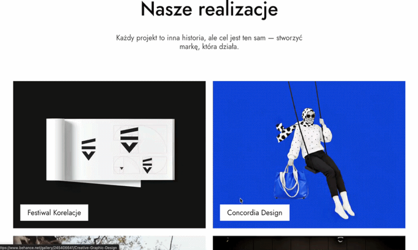
Portfolio
The proof - visual, browsable, credible. Once the visitor knows what Origami does, the work confirms they do it well. Ordered to build trust progressively. It redirects to detailed case studies on Behance. -
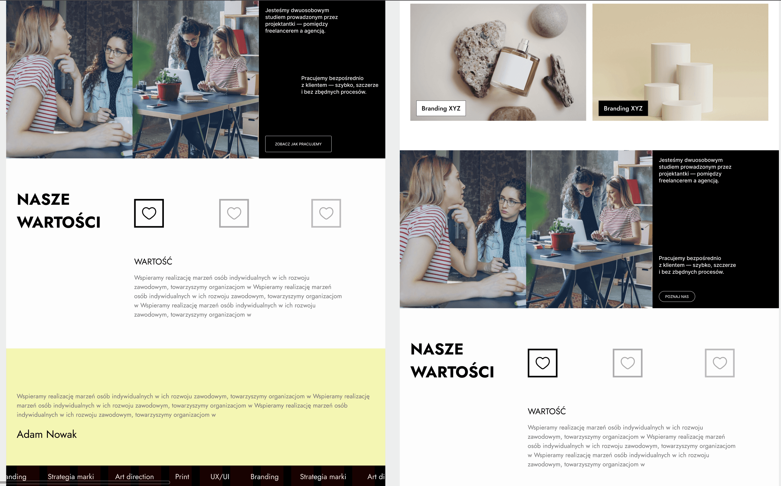
About us
Who you’d be working with - warm, human. Clients hire people. The about us section creates a personal connection before the ask. Encourages exploration of individual expertise. -
Values
Why Origami - expressed through clickable tiles. Implemented as minimal interactive tiles - more engaging than a list, less aggressive, engaging with small interaction. -
Testimonials
Social proof - one strong voice. Single quote, well-placed. Enough to validate. Not so many, so it’s quality over quantity. -
Footer with strong contact CTA
Framed as a conversation starter, not a form. “Let’s talk” - low barrier, warm tone.
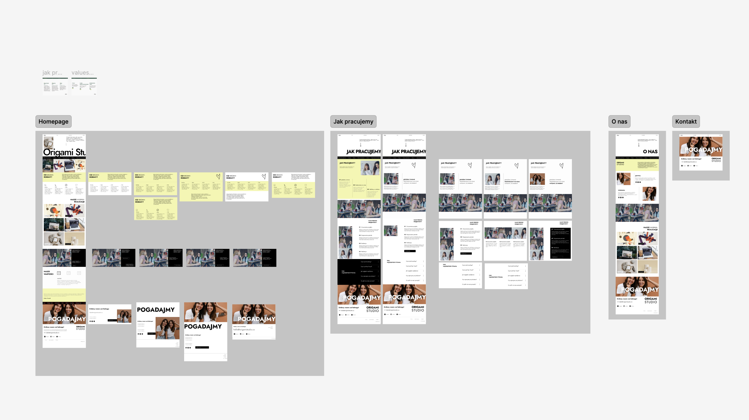
Wireframes
The stylistic direction came out of this conversation too as a set of clear constraints that Origami Studio articulated themselves. Large typography, generous white space, subtle animations. A neutral palette with one warm accent. No reference to origami - literally or symbolically. No over-engineered effects. The word they kept using was minimal, but what they really meant was intentional.
There was also a parallel process happening: Justyna and Weronika were refreshing their own brand identity at the same time. That meant we were sometimes designing against suggestions rather than final assets - making educated calls about typography scale and spacing while the branding was still settling around us.
Action
Design challenge - website personality
The biggest creative tension of the project wasn’t aesthetic - it was interactive. Origami Studio explicitly didn’t want heavy animations or flashy micro-interactions. But a page with no movement at all reads as static and unconfident. The challenge was finding interactions that felt like the site was breathing, not performing.
Motion without spectacle
Origami Studio wanted subtlety, not stillness. We explored interactions that enhance the feel of quality without drawing attention to themselves - things you notice only when they’re absent.
Designing without final brand assets
The branding refresh was running in parallel. We had to make confident spatial and typographic decisions based on direction and intention rather than finalized files.
Iteration without drift
Multiple rounds of feedback across four designers risked losing the original direction. We kept the structure stable throughout - all the iteration was in the details, not the foundation.
Result
The website launched alongside Origami Studio’s refreshed brand identity - the two things the team had been building in parallel finally coming together. The timing mattered: the site wasn’t catching up to a new brand, it was part of the same reveal.
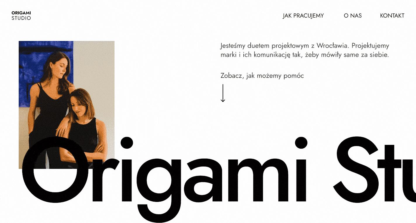
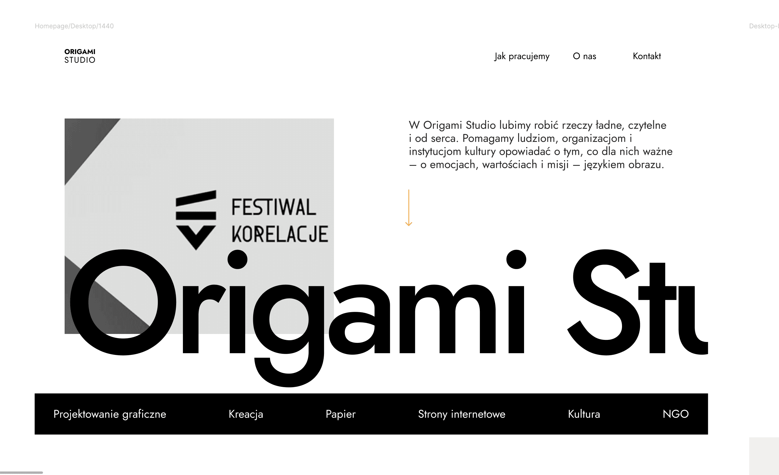
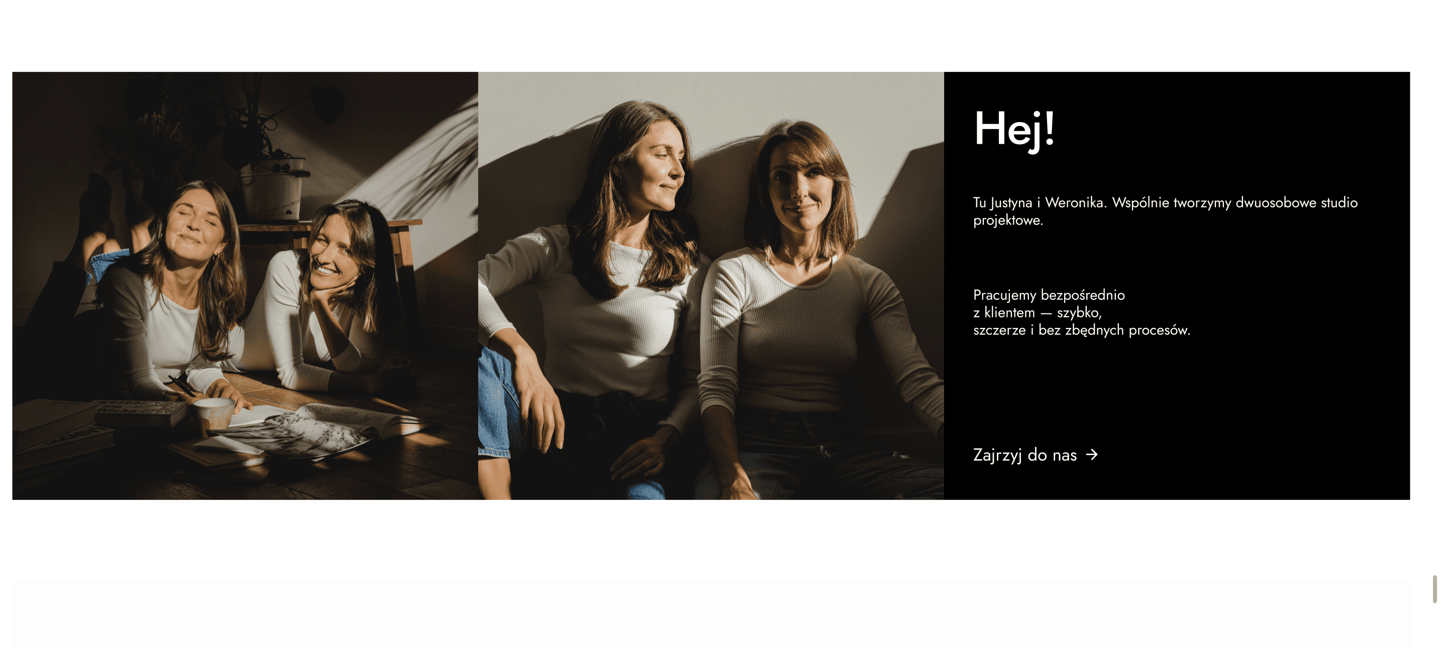
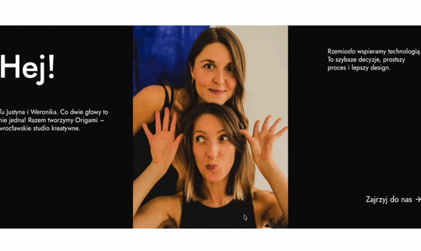
Hero
We used a scroll effect that reveals the studio’s full name to add a subtle interactive touch right from the start.
Services
Right below the hero section, we highlighted the range of design services and added icons to make it easier to identify each category. A black looped marquee serves to widen the range of Origami Studio’s specialization.
Portfolio
Origami Studio designed the visually appealing thumbnails for Behance projects and we added a subtle hover effect to highlight the clickable elements.
About us
Hovering over the photo reveals a second image, which playfully reduces the distance between the studio and potential clients.
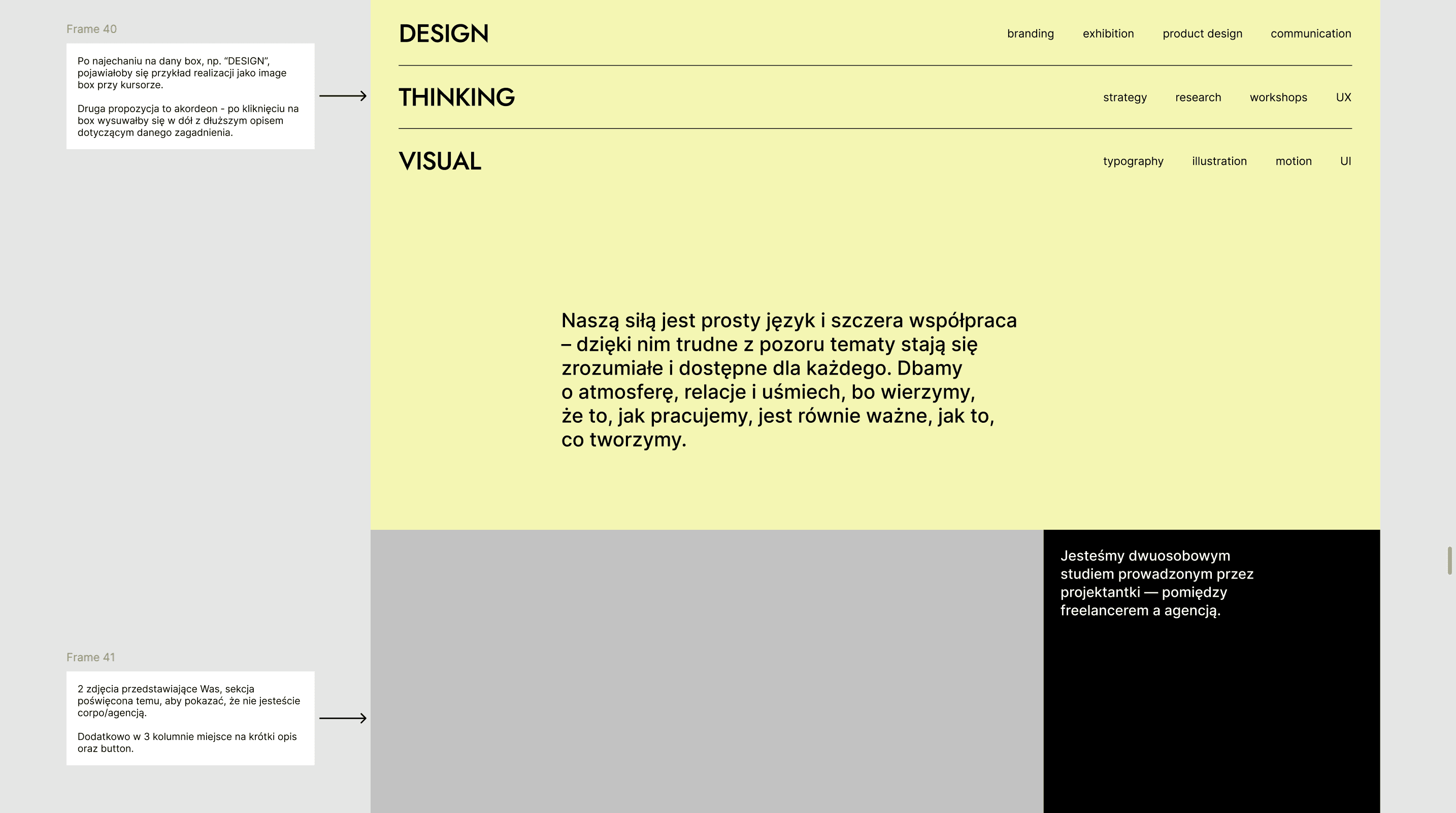
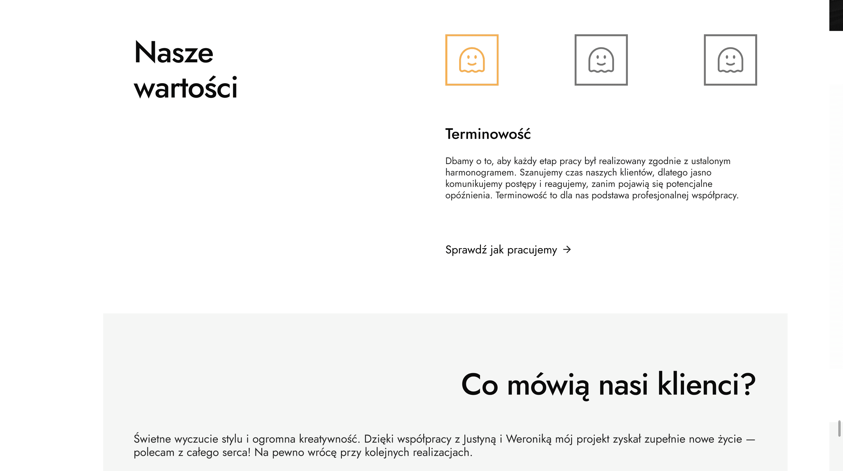
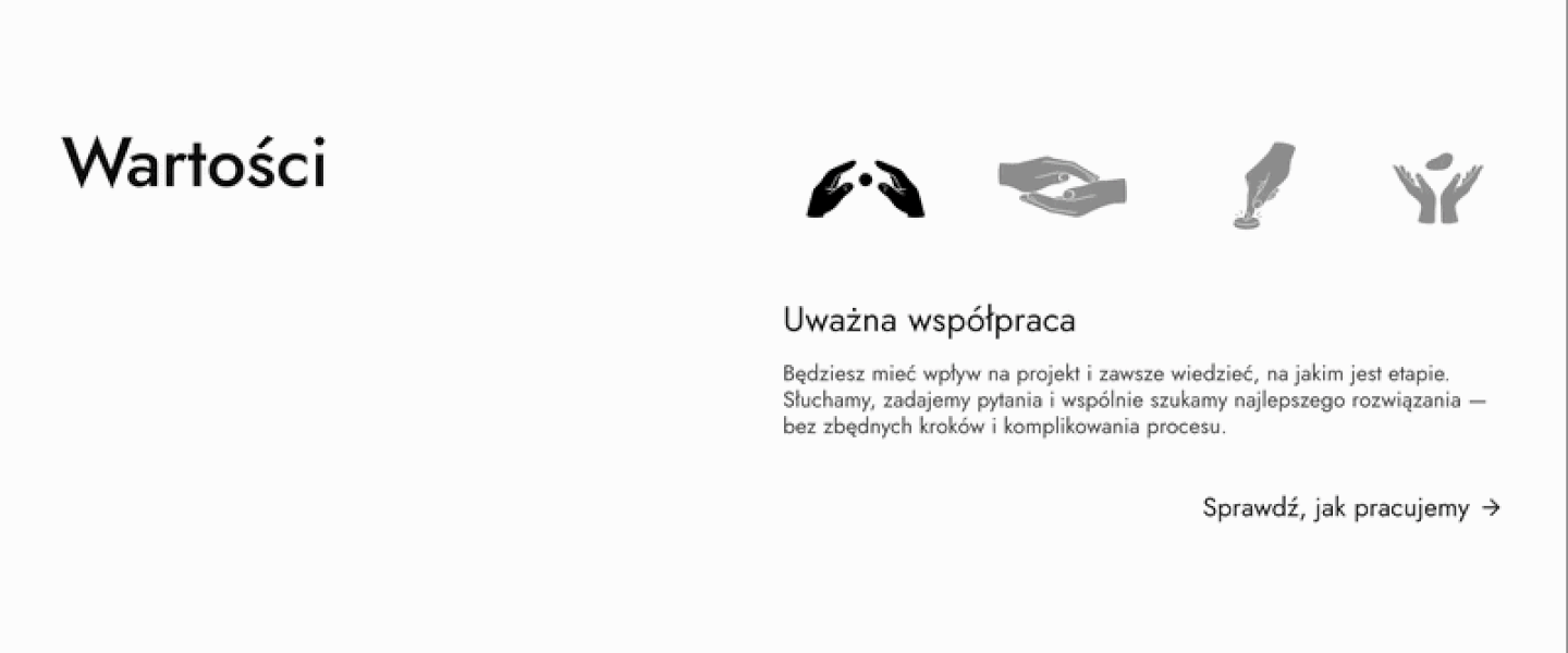
Values
Each value has its own clickable icon and users can learn more about how Origami Studio works by clicking the button.
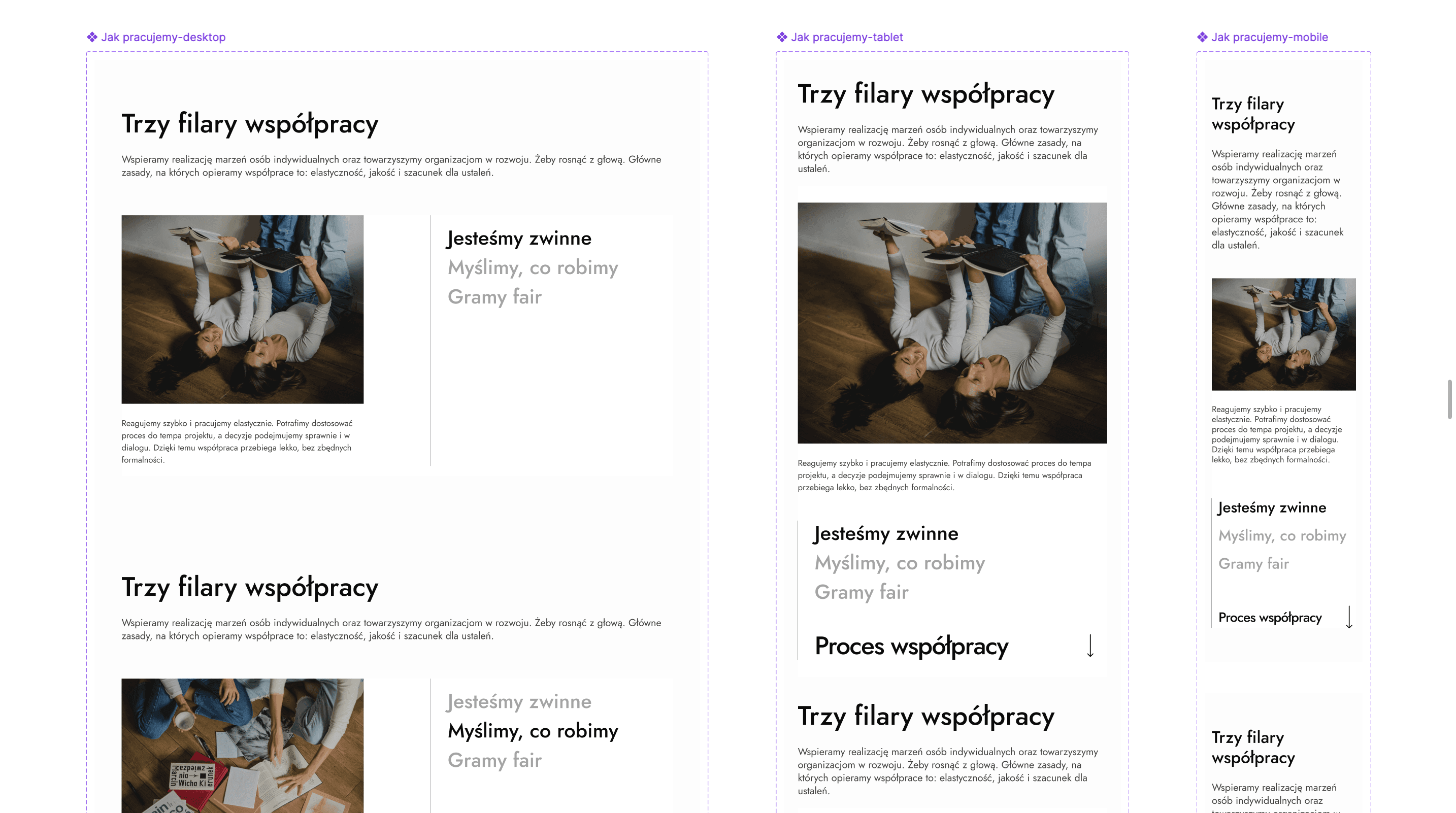
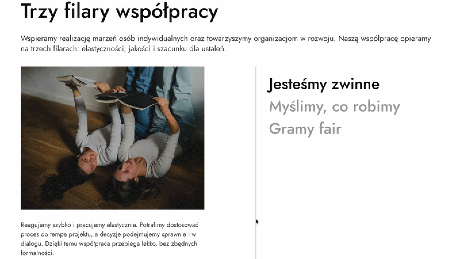
Partnership pillars
Clearly highlighted pillars of cooperation, with explanatory text below the photo, allowing everything to fit into a single section without requiring users to scroll more when there is a larger amount of text.
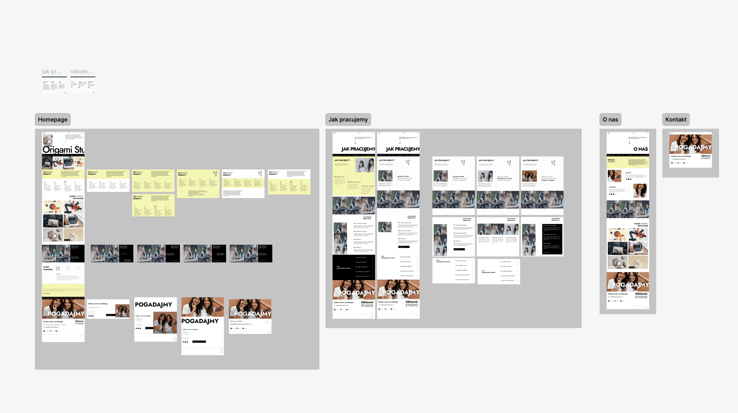
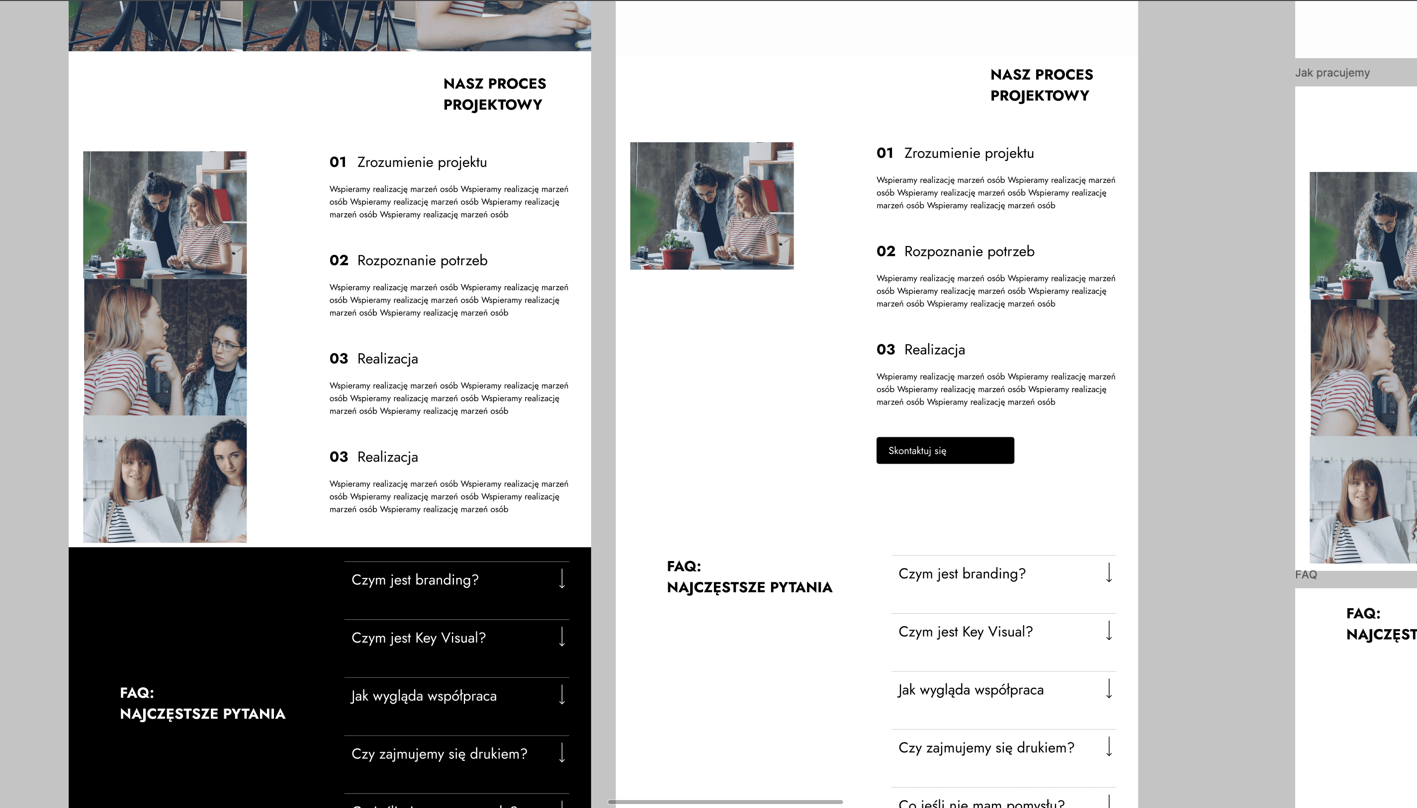
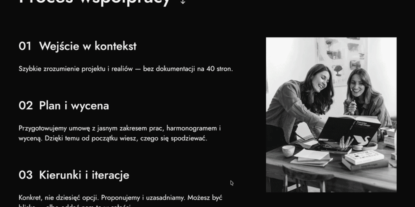
Cooperation process
Given the broad range of Origami Studio’s design specializations, it was important for the potential client to see an overview of the design process so they would be aware of the specific steps taken during collaboration. A small detail is the sticky image that responds to scrolling.
Summary
The website launched alongside Origami Studio’s refreshed brand identity - the two things the girls had been building in parallel finally coming together. The timing mattered: the site wasn’t catching up to a new brand, it was part of the same reveal.
Clear client journey
The information architecture guides visitors from curiosity to contact without any dead ends - the structure does the conversion work quietly.
Brand coherence
The site and the new identity launched together, presenting a unified face. Large typography and warm neutrals carry through both.
Built in Figma Sites
Full implementation handled in Figma Sites - giving the clients ownership of the final product in the Figma environment, which designers are already familiar with - without the complexity of a traditional development handoff.
Process that scaled
A four-designer team with clear role boundaries and an established workshop framework - a structure that can be replicated for future collaborative projects.
Minimal, not empty
The values tiles and portfolio hover states give the site tactile quality without undermining the restraint. Motion serves content, not the other way around.